When My Screen Turned Liquid
When My Screen Turned Liquid
That Tuesday afternoon felt like wading through digital cement. My thumb swiped across endless grids of corporate blue and clinical white, each icon screaming productivity while sucking the soul from my device. I caught my distorted reflection in the black mirror - tired eyes mirroring the exhaustion of interacting with something that felt less like a portal and more like a spreadsheet. That's when Elena shoved her phone under my nose during lunch break. "Stop torturing yourself," she laughed, as schools of iridescent fish darted between her app icons. The water-effect wasn't static; it rippled when she touched it. My pragmatic mind protested - utility over aesthetics! - but my fingers itched to dive in.
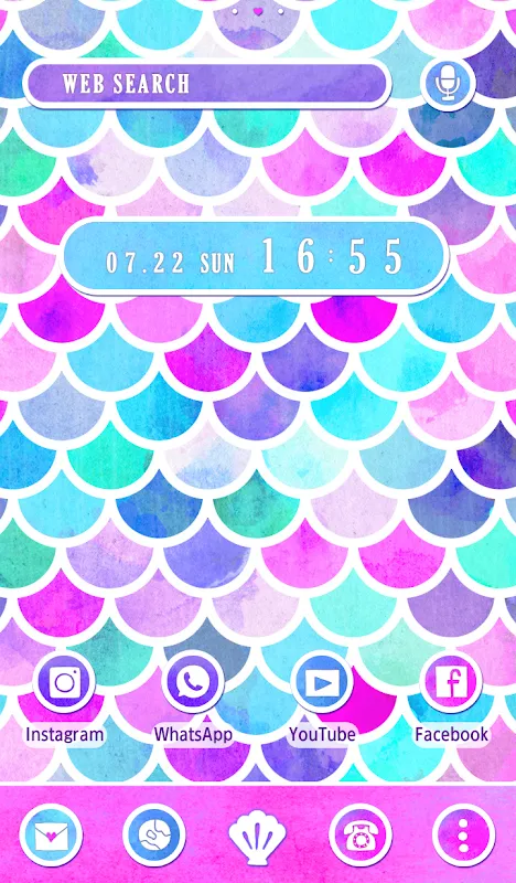
Installing it felt like breaking rules. Permission requests flooded my screen like tidal warnings. The rendering engine demanded access to everything short of my dental records. Yet when the transformation completed, my breath hitched. Where static squares once lived, anemones pulsed with light. Touching the weather widget sent liquid gold swirling toward my fingertips. The calendar didn't just display dates - tide patterns ebbed and flowed through scheduled meetings. For three dizzying days, I'd catch myself staring instead of scrolling, tracing bioluminescent pathways between apps like some digital marine biologist. Charging my phone became feeding time; I'd watch plankton drift upward as the battery percentage climbed.
Then came the coral reef incident. Tuesday's important Zoom call with investors. My custom wave animation background seemed harmless until virtual kelp forests obscured the shared financial spreadsheet. "Are you... underwater?" the CFO squinted. I stabbed desperately at settings while frilly gorgonian corals bloomed across profit margins. Later investigation revealed the depth slider I'd bumped while sleep-customizing at 3AM. The physics engine interprets touch pressure as depth perception - a beautiful nightmare when your thumb trembles during tense negotiations. Elena found my panic hilarious; I nearly threw my phone into actual seawater.
Technical magic comes at cost. My battery started draining faster than a tidal pool at sunset. Digging into developer options revealed why: the parallax effect uses gyroscopic data to shift aquatic layers independently. Beautiful? Absolutely. But watching my battery graph plunge like a sinking ship forced compromises. I killed the shoals of procedural fish (farewell, Nemo) and reduced wave complexity. The trade-off stung - sacrificing ecosystem richness for longevity felt like bulldozing coral for a parking lot. Yet even simplified, the fluid dynamics algorithm remained hypnotic. Watching app icons distort like objects viewed through moving water triggers something primal in the hindbrain.
Critically? The illusion shatters when non-themed apps intrude. Banking applications look like toxic waste spills against the seascape. Social media icons become floating trash - unintentional commentary on digital pollution. And don't get me started on system update notifications: jarring robotic pop-ups shattering the oceanic immersion like cruise ship anchors. Yet when twilight hits my apartment and the screen's blues deepen into midnight trenches? I'll endure the occasional plastic bag interface for those moments when my device feels alive, breathing with me in the dark.
Keywords:+HOME,news,launcher customization,fluid UI,digital aesthetics


