A Personal Touch with Creative Launcher
A Personal Touch with Creative Launcher
It all started on a dreary Tuesday morning, as I stared blankly at my phone's static home screen, feeling that familiar pang of digital monotony. I had been using the same stock Android launcher for years, and every swipe felt like trudging through mud—slow, uninspired, and utterly predictable. My thumb hovered over the download button for Creative Launcher, an app I had heard whispers about in online forums, promising a revolution in personalization. Little did I know, this would become a day of emotional highs and frustrating lows, a rollercoaster that left me questioning how much control I truly had over my digital life.
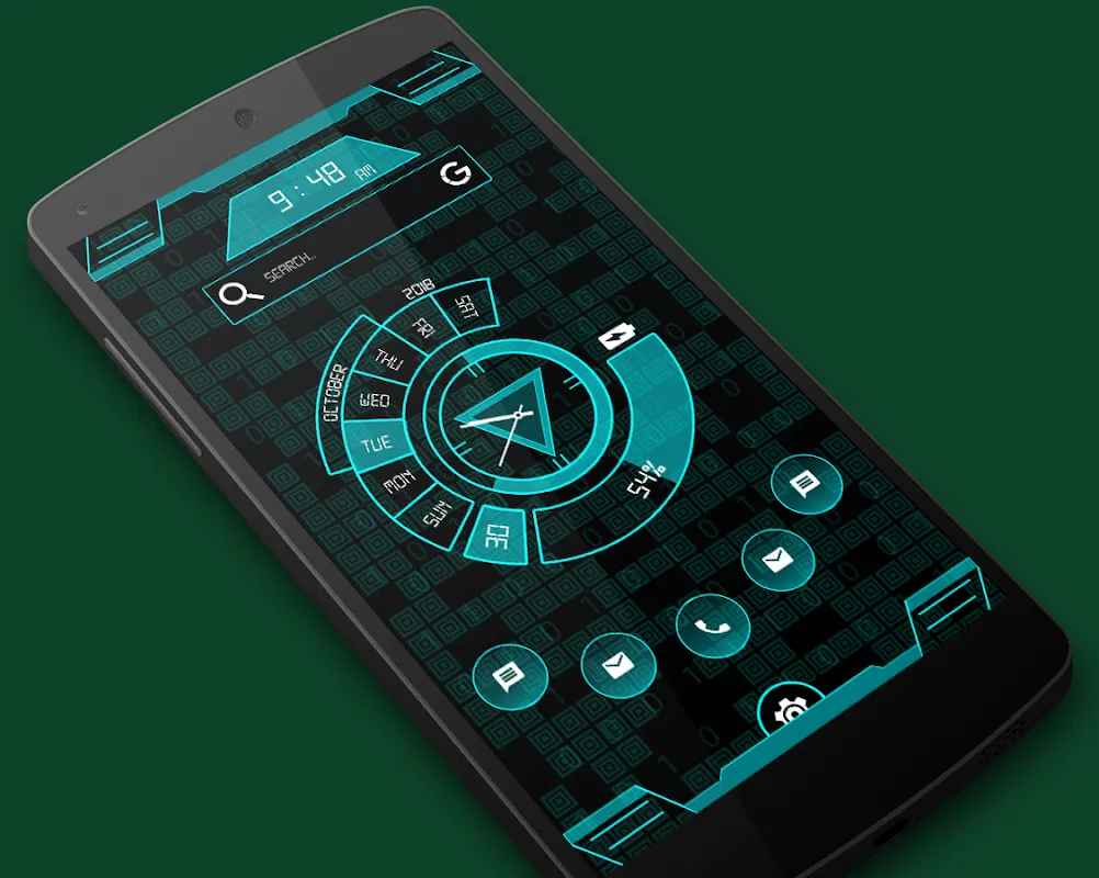
The installation was swift, almost too easy, and as the app booted up, I was greeted by a splash screen that shimmered with what I can only describe as digital confidence. It wasn't just a loading screen; it was a statement, with gradients that shifted from deep blues to vibrant oranges, hinting at the customization prowess ahead. My heart skipped a beat—this was no ordinary launcher. I dove into the settings, my fingers dancing across the screen with a mix of trepidation and excitement. The first thing that caught my eye was the dynamic wallpaper feature. I had experimented with live wallpapers before, but they always drained my battery or stuttered like a bad movie. Here, though, I selected a theme that promised to adapt to my usage patterns, and as I watched the background morph from a serene sunrise to a bustling cityscape as I opened my email app, I felt a genuine thrill. It wasn't just pretty; it felt alive, responding to my every tap with a fluidity that made my old setup seem archaic. I spent a good hour just playing with the transparency sliders, adjusting the color saturation until the wallpaper blended seamlessly with my app icons, creating a cohesive visual experience that was uniquely mine. This wasn't just customization; it was artistry, and for a moment, I forgot I was holding a phone—it felt like a portal to my own little universe.
But then, reality hit like a slap in the face. Eager to secure my private apps, I ventured into the AppLock section, only to be met with a labyrinth of settings that left me scratching my head. The interface was cluttered, with tiny icons and vague labels that made me feel like I was deciphering ancient hieroglyphics. I tried to set a pattern lock for my messaging app, but the app crashed not once, but three times, each time erasing my progress and forcing me to start over. My initial excitement curdled into frustration; I could feel my blood pressure rising as I muttered under my breath, "Why does something so simple have to be so damn complicated?" It was a stark reminder that even the most polished apps have their flaws, and this one felt like a beautiful car with a faulty engine. I eventually got it working after a grueling 20 minutes, but the joy had been sapped away, replaced by a simmering annoyance that lingered like a bad smell.
Amid the chaos, I found solace in the smart widgets, which I initially overlooked. These weren't your typical static blocks of information; they were intelligent, pulling data from my calendar and weather apps to display context-aware updates. For instance, as I scheduled a meeting, the widget subtly highlighted the time slot with a soft glow, and when rain was forecast, it dimmed the background to a cooler hue. It was these small, thoughtful touches that showcased the underlying technology—likely leveraging machine learning algorithms to predict user behavior—without screaming "techy" at me. I recall one evening, as I scrolled through my photos, the widget suggested a collage based on recent events, and it was eerily accurate, piecing together shots from my weekend hike. That moment of serendipity made me appreciate the effort behind the scenes; it wasn't just about looks, but about creating an ecosystem that anticipates needs. Yet, even here, I encountered a hiccup—the widget occasionally lagged when updating, especially during peak usage, which felt like a betrayal of its smart promise. It was a love-hate relationship; I adored the innovation but cursed the inconsistencies.
As the day wore on, I decided to explore the theme customization, hoping to recapture that initial spark. I delved into the color palettes, experimenting with shades that reflected my mood—from calming pastels during work hours to bold, energetic tones for my downtime. The app allowed me to save multiple themes, and switching between them was as smooth as flipping a page in a book. I remember setting up a "focus mode" theme with minimal distractions, and the instant I activated it, my productivity soared. It was like having a digital assistant that understood my rhythms, and I found myself grinning like a kid in a candy store. But then, I stumbled upon the HideApps feature, which promised to tuck away sensitive applications from prying eyes. The execution, however, was sloppy; hiding an app required navigating through multiple menus, and once hidden, it was nearly impossible to retrieve without a tutorial. I felt a surge of irritation—why offer a feature if it's going to be this cumbersome? It was a classic case of over-engineering, where simplicity was sacrificed for the sake of inclusion, and it left me wondering if the developers had ever actually used this in real life.
Throughout this journey, I couldn't help but marvel at the technical ingenuity behind the dynamic wallpapers. They aren't just pre-rendered videos; from what I gathered, they use adaptive rendering engines that adjust in real-time based on device performance and user interaction. This means the wallpapers consume less battery by scaling complexity—a far cry from the resource hogs I had dealt with before. On days when my phone felt sluggish, I noticed the wallpapers simplifying their animations, almost like a thoughtful nod to my device's limits. It's details like this that separate good apps from great ones, and despite the flaws, this aspect felt like a masterstroke. Yet, the emotional toll was real; one minute, I was basking in the glow of a perfectly customized home screen, and the next, I was groaning at a buggy lock screen. It was a dance of delight and despair, and by nightfall, I felt emotionally drained but oddly satisfied. This launcher had pushed me to see my phone not as a tool, but as an extension of myself—flaws and all.
In the end, my experience with Creative Launcher was a mixed bag of awe and annoyance. It taught me that personalization isn't just about aesthetics; it's about how an app makes you feel—empowered one moment, exasperated the next. I'll likely keep using it, warts and all, because when it shines, it's brilliant, but I won't forget the moments it let me down. If you're considering a change, be prepared for a ride that's as unpredictable as it is rewarding.
Keywords:Creative Launcher,news,dynamic wallpapers,app customization,smart widgets


