Before Launcher: My Screen Sanity Saver
Before Launcher: My Screen Sanity Saver
The incessant buzz of my phone felt like a woodpecker drilling into my skull that rainy Thursday. I'd just spilled coffee on my keyboard while juggling Slack pings, Twitter rants, and a blinking calendar reminder for a meeting I'd forgotten. My thumb danced across the glowing chaos—38 unread emails, 17 app badges screaming for attention, neon game icons mocking my productivity. In that moment, my Android device wasn't a tool; it was a dopamine-sucking anxiety generator strapped to my palm. The screen's glare reflected my twitching eye as I wondered why I'd paid $1,200 for this electronic panic attack.
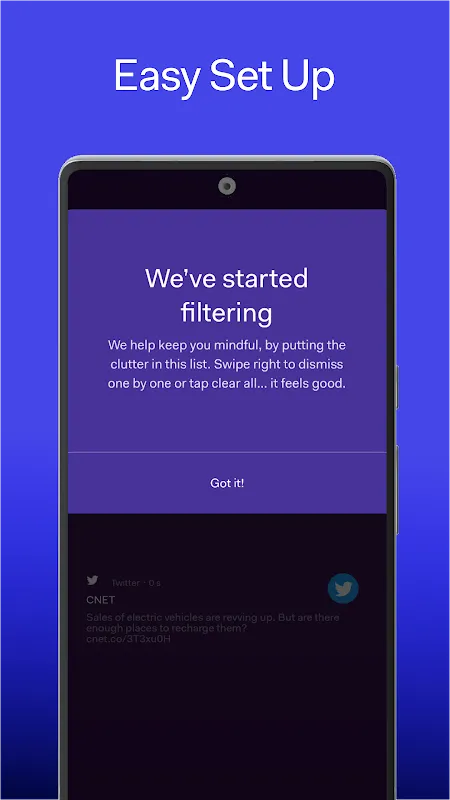
A developer friend saw me mutilating my power button and slid her phone across the table. "Try this," she said. Her device showed nothing but elegant gray text on black: *Messages. Calendar. Camera.* No candy-colored distractions, no parasitic notifications. Just words. I scoffed—how could this skeletal interface possibly handle my workflow? Yet something primal stirred when my finger brushed its cool surface. The installation felt like shedding lead weights; watching my garish app zoo vanish replaced by monastic simplicity triggered actual physical relief in my shoulders. This wasn't design—it was digital exorcism.
First revelation came at 3AM during a coding sprint. Normally, my phone would've bombarded me with YouTube nudges and shopping deals. Instead, Before Launcher's deliberate friction made me pause: I had to *type* "Twitter" fully before accessing it. That five-second hurdle killed my autopilot scrolling. The underlying architecture fascinates me—by stripping the GUI to barebones text, it exploits how our brains process language versus images. Visual icons trigger instant limbic responses; reading "Instagram" forces prefrontal engagement. That cognitive speed bump saved me from three midnight rabbit holes that week alone.
But the real magic struck during my daughter's piano recital. Pre-Before, my phone would've lit up with work alerts during her Chopin piece. Now, its intentional silence held space for the moment—no buzzes, no flashes. Just me noticing how her small fingers trembled on the keys before finding their courage. Later, checking my usage stats felt like reading a sobriety chip: 57% fewer unlocks. The launcher doesn't just hide apps; it architects behavioral change through calculated inconvenience. Want TikTok? Type seven characters and confront your intention. Genius or cruel? Both.
Of course, I cursed it when lost in a new city needing Maps. Scrolling would've been faster than typing "navigation" as rain soaked my collar. Yet that frustration birthed unexpected presence—I noticed street art and bakery smells instead of glued to blue dot. The trade-off stings sometimes: I miss widget glances at my calendar. But when deadline hell descends and my screen shows only "Focus Timer" in stark letters, I kiss this stubborn digital monk. It weaponizes minimalism like a scalpel—cutting distractions while preserving vital arteries. My phone finally feels like a tool, not a toxin.
Keywords:Before Launcher,news,digital minimalism,focus enhancement,productivity design


