My Phone's Aesthetic Awakening
My Phone's Aesthetic Awakening
Rain lashed against my apartment windows last Thursday, trapping me in that gray limbo between work and exhaustion. I thumbed my phone awake for the hundredth time that evening, greeted by the same clinical grid of corporate blues and sterile whites. That Samsung default interface felt like a fluorescent-lit office cubicle – functional but soul-crushing. My thumb hovered over the productivity app I’d opened out of habit, but something snapped. Why did my most personal device feel like a borrowed tool?
That’s when I ripped off the digital band-aid and dove into Theme Packs. Not the gentle toe-dip of cautious downloading, but the cannonball plunge of someone who’d hit aesthetic rock bottom. First shock? The onboarding didn’t ask for my firstborn child or demand access to my dental records. Just clean permissions for what mattered: home screen, lock screen, icons. Refreshingly honest in an age of data vampires.
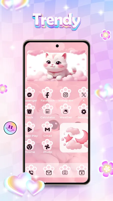
I craved warmth, something tactile to counter the rainy gloom. Scrolling through the "Claymation Dreams" pack, I actually laughed aloud. Here were icons shaped like squishy, hand-sculpted blobs – Gmail as a lumpy envelope, Spotify a wonky vinyl record. Applying it triggered a minor revelation: adaptive icon masking. See, Android butchered third-party icons by slamming them into uniform shapes. But Theme Packs? It preserved the clay texture’s imperfect edges, letting them bleed slightly outside Google’s rigid containers. Like seeing brushstrokes on a digital canvas.
Then came the widgets. Oh, the widgets. I slapped a weather widget onto my home screen that didn’t just show temperatures – it *felt* like weather. When thunderstorms loomed, the background darkened to bruised purples, with subtle animation mimicking distant sheet lightning. Not garish GIFs, but delicate shifts using OpenGL ES shaders for parallax layers. My finger traced the raindrops sliding down the glass-panel design, each drop refracting light differently based on my phone’s gyroscope tilt. Pure sorcery.
But the real gut-punch was the live wallpaper. I chose "Koi Pond at Dusk" – not some cheap animated loop, but a reactive ecosystem. Tapping the screen scattered virtual fish food; swiping created ripples that disturbed lily pads. At 9pm, the scene seamlessly transitioned to moonlight, koi scales glinting silver. Later, digging into settings, I discovered this used a procedural generation algorithm – no two ripples or fish paths identical. It consumed 8% more battery, yes, but watching those digital koi glide past my calendar notifications? Worth every stolen joule.
Of course, rage flared too. Trying to mix a minimalist icon pack with a baroque clock widget created visual chaos worthy of a toddler’s art project. Theme Packs’ "Smart Match" feature promised harmony but occasionally vomited clashing color palettes. And when I dared venture into the "Deep Customize" menu? Prepare for hieroglyphics. Terms like "APK signature v2 scheme validation" and "zygote preloading" appeared with zero explanation. I felt like an archeologist stumbling upon alien tech – awed but utterly lost.
Three days later, unlocking my phone delivers a visceral jolt of joy. My home screen breathes now – icons pulse gently when notifications arrive, the wallpaper’s koi circle lazily around unread emails. That sterile tool has become a pocket gallery, reacting to my touch, my time of day, even my damn mood. Do I care that the "Cyberpunk Neon" pack crashed twice during setup? Not when scrolling feels like conducting light. Theme Packs didn’t just decorate my device; it rewired how I experience digital intimacy. Rain still hits the windows, but my world’s glowing warmer.
Keywords:Theme Packs,news,android customization,adaptive icons,live widgets


