PastelNote: My Mind's Quiet Harbor
PastelNote: My Mind's Quiet Harbor
Rain lashed against the coffee shop window as my thoughts scattered like dropped marbles. I'd escaped deadline hell for a caffeine fix, but my brain kept looping through unfinished code snippets and unanswered emails. That's when I saw her - an elderly woman carefully arranging wildflowers in a mason jar, each stem placed with deliberate tenderness. A visceral memory flooded me: my grandmother teaching me flower language in her sun-drenched garden. I fumbled for my phone, terrified the fragile moment would evaporate like steam from my chai. My usual note app demanded folders, tags, formatting - digital bureaucracy smothering inspiration. Then I swiped open the pastel sanctuary.
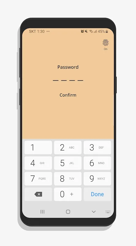
Mint-green canvas greeted me like a deep breath. No menus, no prompts - just empty space waiting. As my thumbs flew across the keyboard, words materialized in soft peach text against that soothing backdrop. The frantic clatter of cups and espresso machines faded. For sixty seconds, I existed solely between that floral arrangement and my screen, capturing petal-soft recollections of grandmother's hands showing me how peonies meant bashfulness and snapdragons signaled grace. The app didn't just record text - it suspended time, creating a pocket dimension where urgency dissolved.
Later that night, reviewing my note, I noticed something extraordinary. The color psychology wasn't just decorative - it functioned as cognitive scaffolding. Lavender headers for memories, sage paragraphs for reflections, and that peach text acting like mental highlighter tape. When I'd tried researching color theory apps before, they felt like lab coats dissecting rainbows. But this? It worked invisibly, organizing thoughts through hue rather than bullet points. My developer mind geeked out discovering they used LAB color space conversions - translating technical precision into emotional resonance.
Of course, it's not all watercolor dreams. Last Tuesday, mid-client call, I needed to paste a screenshot into my meeting notes. What followed was a farcical ballet of zooming, cropping, and accidental screen captures that nearly made me yeet my phone across the room. The app treats images like uninvited guests at a meditation retreat - functional but clearly resented. Yet this limitation birthed unexpected creativity. Instead of inserting the chaotic spreadsheet screenshot, I described its essence in three tangerine-hued sentences - and shockingly, understood the data better.
What began as digital notetaking has rewired my creativity. Yesterday, stuck on a UI design, I opened a new cornflower-blue note and typed: "What would water feel like here?" Absurd? Maybe. But thirty minutes later I was prototyping fluid gesture controls inspired by river currents. The magic isn't in features - God knows it lacks a hundred things Evernote does - but in its ruthless elimination of friction. When inspiration strikes like lightning, this app is the lightning rod, not the bureaucracy demanding paperwork during the storm. My notes now feel like pressed flowers in a journal - delicate, vivid, and alive with the moment they were captured. Even as I write this, a butter-yellow note floats on my screen containing just two words: "Remember breathing." Damn right I will.
Keywords:PastelNote,news,digital minimalism,creativity tools,color psychology
