Arcticons: Minimalist Line Icons That Transformed My Android Experience
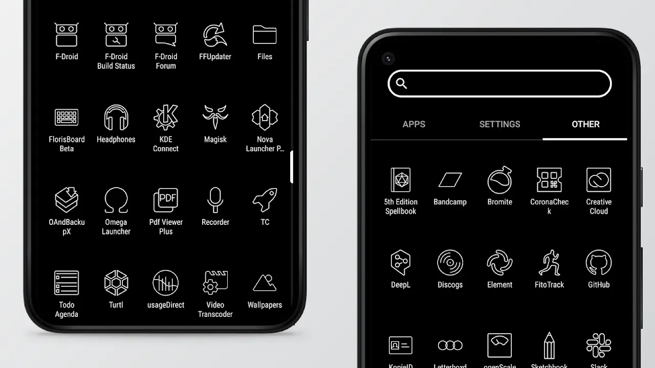
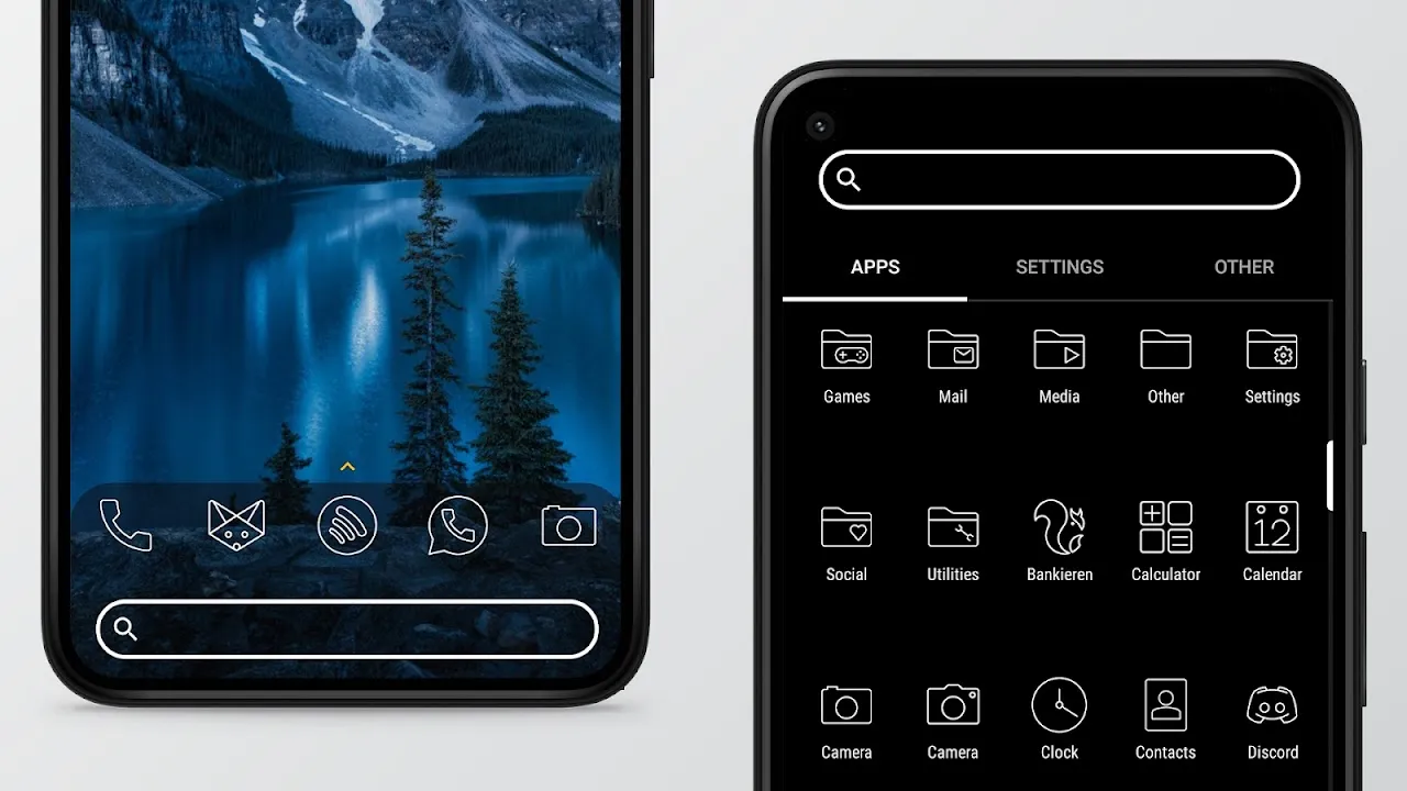
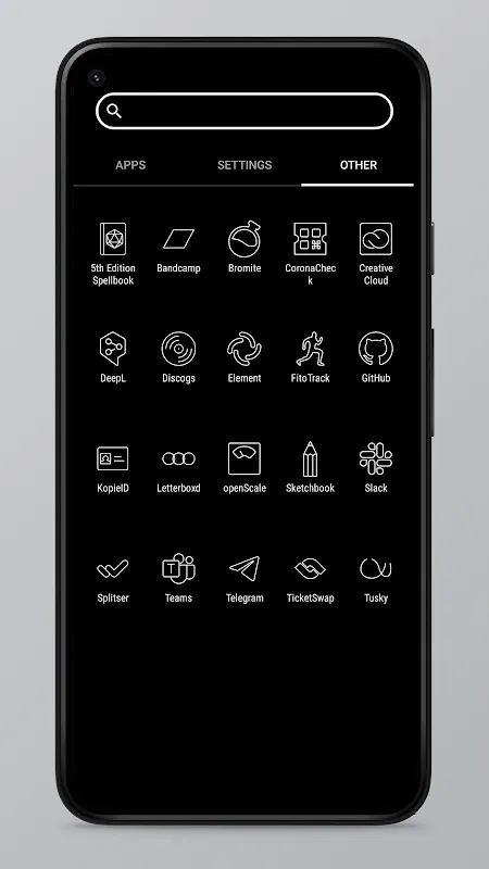
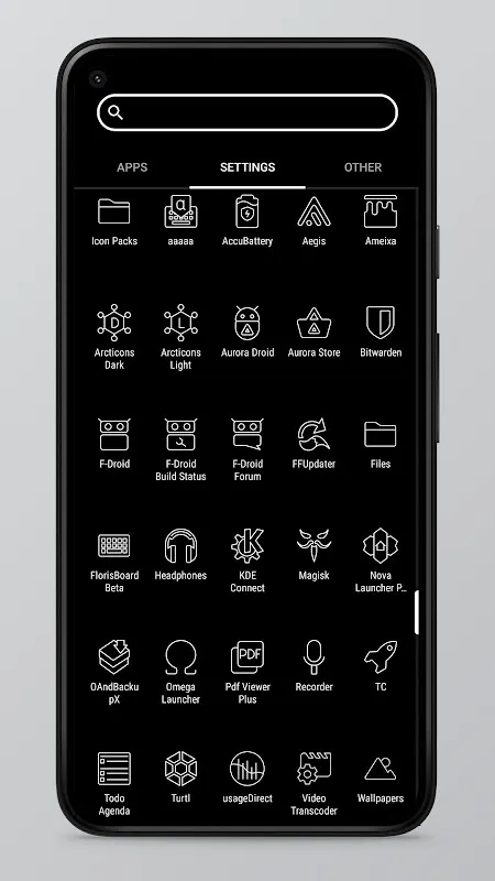
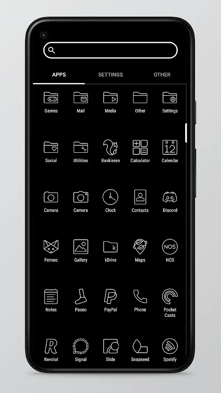
Staring at my chaotic home screen felt like deciphering abstract art – mismatched icons clashing, corporate logos screaming for attention. That visual noise drained me until Arcticons arrived. As a UI designer who obsesses over digital aesthetics, this open-source gem didn't just organize my apps; it gave my phone a soul through 10,000+ hand-drawn line icons. Now every swipe feels like flipping through a designer's sketchbook.
What hooked me first was the obsessive consistency. Each icon shares the exact stroke weight and geometric precision. When applying them via Nova Launcher, I watched my banking app transform from a garish green monster into an elegant vault outline. That moment felt like wiping fog off glasses – sudden clarity where chaos once lived. Weeks later, muscle memory still delights me; fingertips glide faster when every shape speaks the same visual language.
The community-powered library surprises me monthly. Last Tuesday, I installed a niche astronomy tool expecting default Android blobs. Instead, a crisp telescope icon appeared – turns out a developer in Oslo had submitted it weeks prior. That's Arcticons' magic: gaps fill organically through global collaboration. When my meditation app lacked representation, I sketched a lotus in their line-art style using Inkscape. Seeing it live three days later gave me creator pride usually reserved for shipped products.
Samsung compatibility required Theme Park gymnastics initially. At 11PM, bleary-eyed, I almost quit when stock icons persisted. But pressing "apply" in Theme Park finally unleashed Arcticons across One UI. Sunrise revealed monochrome perfection – even Samsung's clunky settings icon became a graceful gear. That victory coffee tasted sweeter knowing I'd conquered Android's fragmentation beast.
Sunday mornings showcase Arcticons' brilliance best. Sunlight stripes my desk as I lift the phone. No logos assault my sleep-softened eyes – just pure outlines: a feather for notes, a droplet for weather, a paper plane for messages. Scrolling feels like browsing gallery etchings where function meets art. During midnight coding sessions, that minimalism becomes functional; icons register faster without color distractions, like finding tools in a tidy workshop.
Here's my raw take: The sheer icon count means I rarely encounter defaults anymore – a miracle for free software. Updates arrive subtly; new icons materialize like secret gifts. But Samsung users, brace for Theme Park's learning curve. My first attempt left duplicate icons until I disabled Samsung's native theming. And while Nova Launcher integration is flawless, watching friends struggle with lesser-supported launchers stings. Still, these are quibbles against transformative design. If you crave order but reject visual clutter, install Arcticons tonight. Your eyeballs will thank you by dawn.
Keywords: Arcticons, Line Icons, Minimalist Design, Android Customization, Open Source
