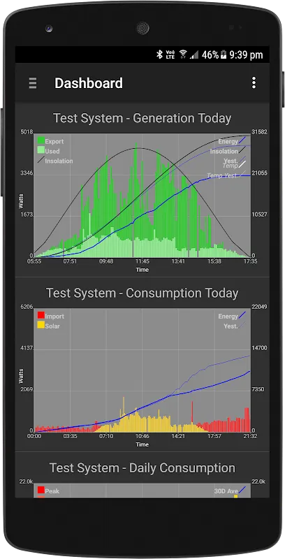
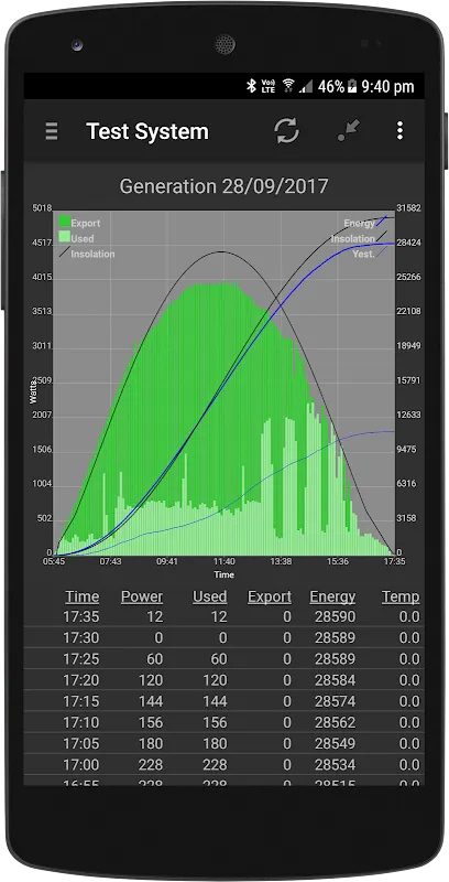
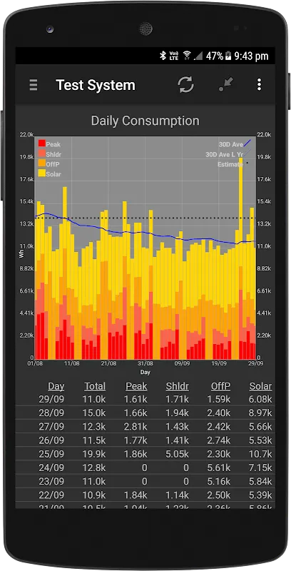
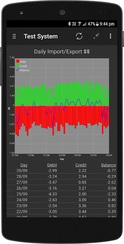
If you're leveraging www.pvoutput.org to monitor your solar energy systems, this app is an indispensable companion designed to enhance your experience. From building custom dashboards to viewing real-time energy flows, it brings your data to life right on your mobile device.
General Features
Easily navigate the app by pulling out the drawer menu from the left. You can search for and add any system or team directly from pvoutput.org, making it simple to keep everything organized. One of my favorite aspects is the ability to create a personalized dashboard with graphs that matter most to me—tapping on any graph takes me straight to the detailed system view.
System Pages
Dive deep into your data with dedicated pages for intraday, daily, weekly, monthly, and yearly metrics. Swiping left or right lets me effortlessly switch between timeframes, while swiping up or down toggles between generation, consumption, import/export in kWh, monetary values, and extended data. The menu on each system page is a powerhouse: I can add graphs to my dashboard, edit system details, configure time-of-use tariffs, manually input data, refresh everything, or remove a system. In portrait mode, I get a clear graph and data grid—tapping the heading hides the graph for a full-screen data list, perfect for focused analysis, and tapping again brings the visual back. Rotating to landscape immerses me in a full-screen graph that’s incredibly detailed. For deeper insights, I can drill into specific data points with a simple click or long press.
Drill Mode
When you enter drill mode—indicated by the period in round brackets in the heading—swiping left or right moves seamlessly between periods, like scrolling through months or years. Hitting the back button exits this mode, which I find intuitive after just a couple of uses. Accessing drill mode via a list click or long press feels natural and responsive.
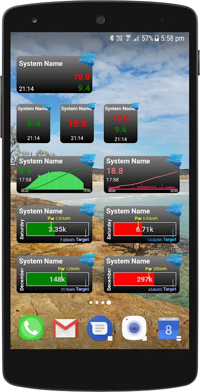
Home Screen Widgets
Stay updated without even opening the app thanks to sleek home screen widgets. There's a basic 1x1 text widget available for free, but for more versatility, an in-app subscription (with a 7-day free trial) unlocks additional text, graph, and progress bar widgets. I love placing a 2x1 widget and resizing it through the configuration screen—clicking the system name reopens customization, and tapping the widget jumps straight into the app. It’s perfect for at-a-glance monitoring.
Live Feeds
For real-time energy visualization, the live feeds feature is mesmerizing. Animated dots show electricity flowing between the grid, your solar panels, and household consumption—watching it during activities like making toast makes energy usage tangible and even fun. This requires an in-app subscription (also with a 7-day trial) and supports Efergy (Energyhive), VeraLite, SolarEdge, and Fronius. It’s fantastic for educating the family on reducing power bills.
Data Access and Limits
Access to pvoutput.org data follows their API limits, but if your system has bonus API features, this app leverages higher rate limits and fetches detailed data for other systems, which I’ve found incredibly useful for comparative analysis.
Final Thoughts
This app excels in making solar data accessible and interactive, though the reliance on subscriptions for advanced widgets and live feeds might be a hurdle for some. Despite that, its depth of features and ease of use make it a top choice for pvoutput.org users. Ideal for homeowners and energy enthusiasts who want real-time insights and historical tracking at their fingertips.
For any issues or suggestions, don’t hesitate to reach out via email at [email protected]. The developer is responsive and values user feedback.
Keywords: pvoutput, solar monitoring, energy data, dashboard, home widgets, live feed, subscription, API
