A Screen Reborn in Black and Teal
A Screen Reborn in Black and Teal
That Tuesday morning, I nearly hurled my phone against the wall. As rain lashed the windows, I fumbled through a kaleidoscope of garish icons—neon greens bleeding into violent purples—searching for my calendar. Each swipe felt like visual whiplash, a jarring reminder of the digital chaos I’d tolerated for years. My thumb hovered over the uninstall button for three preloaded apps I never used, their candy-colored logos mocking my exhaustion. That’s when I remembered the teal.
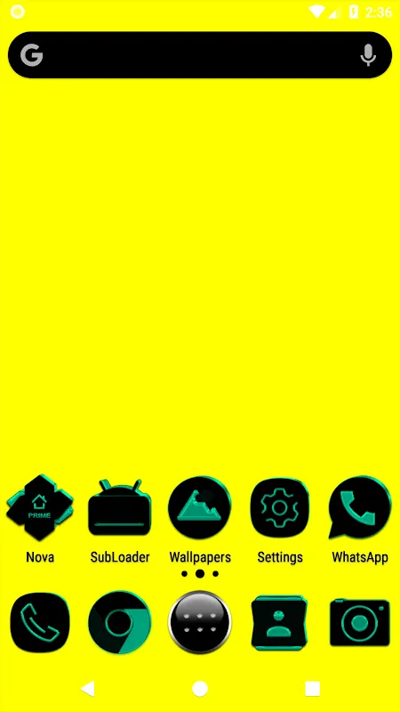
I’d stumbled upon it weeks prior, buried in a forum thread raving about "cohesive aesthetics." Skeptical, I’d downloaded it on a whim, then abandoned it in my app graveyard. Now, desperate, I tapped the dormant icon. What unfolded wasn’t just customization—it was catharsis. The first wave of replacements washed over my screen: Slack’s jagged blue ‘S’ melted into a sleek, onyx circle kissed by a single teal wave. Gmail’s frantic red envelope transformed into a minimalist paper plane gliding through a teal-tinted sky. My breathing actually slowed. For the first time, my device felt less like a scattered toolbox and more like a curated gallery.
The Alchemy of Pixel-Perfect PrecisionWhat hooked me wasn’t just beauty—it was the vector-based sorcery humming beneath the surface. Most packs slap flat colors onto shapes, but this one used scalable paths that retained razor edges even when I pinched to scrutinize them. I spent an entire lunch break zooming into the weather app’s cloud icon, marveling at how its subtle teal gradient mimicked twilight. The real genius? Adaptive masking. When I installed a niche plant-care app lacking custom art, the pack didn’t shrug—it wrapped the generic logo in a matte-black frame with a teal droplet watermark, making it look intentionally austere. This wasn’t decoration; it was optical engineering.
By week’s end, my relationship with the device shifted. Unlocking it became a tiny ritual of relief. The monochrome-teal harmony acted like visual white noise, mutting digital anxiety. I caught myself actually organizing apps by hue depth—deep teals for productivity, lighter accents for leisure—something I’d mocked as obsessive weeks prior. Even my partner noticed, snatching my phone during dinner: "Why does your Uber look like a damn luxury brand?" I just grinned, swirling wine in my glass. The pack had turned mundanity into elegance.
When Perfection StumblesThen came the rage. Last Friday, preparing a critical presentation, I opened my banking app—and choked. Amidst the black-and-teal symphony, it glared back in unchanged, corporate cobalt. A relic of my pre-transformation life. I frantically checked the icon count: 5500+ promised, yet this eyesore slipped through. For ten furious minutes, I combed settings, hunting for a manual override before realizing the pack’s flaw—it relied on app package names, and my bank used regional coding the designer hadn’t cataloged. I nearly reverted everything right then. Instead, I buried it in a folder labeled "Ugly Necessities," seething at the compromise. Perfection, it seemed, had its limits.
That hiccup, though, highlighted the pack’s deeper brilliance. Its theme engine didn’t just skin surfaces—it exploited Android’s adaptive icon framework to reshape masks and shadows dynamically. While cheaper packs become pixelated blurs on larger screens, this one used SVG rendering to stay crisp on my tablet, my foldable, even my old backup phone. I tested it obsessively, rotating devices like a mad scientist, thrilled when shadows fell identically across every display. The developer hadn’t just drawn icons; they’d architected light.
Now, three months deep, the magic persists. Yesterday, a colleague gaped at my home screen during a Zoom call. "Is that a custom ROM?" she whispered. I shook my head, flicking to a teal-infused calculator. "Just a pack." Her envy was palpable. Yet beyond vanity, it’s the psychological respite I cherish most. In a world screaming for attention through notifications and alerts, my screen whispers back in restrained elegance. Those 5500+ icons aren’t just pixels—they’re my digital sanctuary. And when that banking app dares to disrupt the harmony? I breathe, open the folder, and dream of the day its developers embrace beauty.
Keywords:Black and Teal Icon Pack,news,Android customization,vector icons,minimalist design


