Aesthetic Awakening on My Screen
Aesthetic Awakening on My Screen
Rain lashed against my apartment windows last Tuesday, mirroring the storm of frustration brewing inside me as I glared at my phone. That same old grid of candy-colored icons felt like visual noise – a garish circus on a 6-inch slab of glass. My thumb hovered over some productivity app disguised as a miniature rocket ship, and something snapped. Why should my digital world look like a kindergarten art project? That's when I stumbled upon Ronald Dwk's creation in the Play Store's depths, a beacon for design-starved eyes promising sophistication through darkness and light.
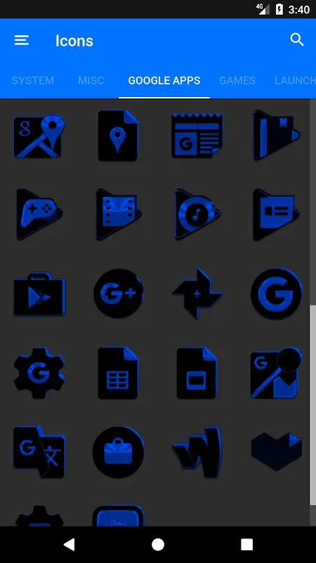
The installation felt like cracking open a designer's sketchbook. Immediately, I was struck by the sheer audacity of scale – over five thousand icons waiting to banish the cartoonish defaults. But it wasn't quantity that hooked me; it was the vector precision in every curve. Unlike raster images that pixelate when you zoom, these mathematical paths rendered edges sharper than a sushi chef's knife. Watching them slot into place felt like watching liquid obsidian flow into perfect molds. My home screen shed its clown suit and slipped into a tailored tuxedo.
Applying the pack became an obsessive ritual. I spent hours in the app's labyrinthine settings, discovering how Ronald engineered adaptive tinting that shifted icon undertones based on wallpaper colors. When I set a deep nebula background, the icons absorbed its cosmic purples; with a concrete texture, they cooled to industrial grays. This wasn't static decoration – it was algorithmic artistry responding to my choices in real-time. The technical wizardry behind this? A clever manipulation of Android's theme engine intercepting color metadata and reprocessing SVGs on the fly. No wonder my phone's processor hummed like a contented cat during the transformation.
But perfection has thorns. Three days into my aesthetic euphoria, I noticed Discord's icon stubbornly refusing to conform – a jarring purple blob in my monochrome symphony. The app's icon request feature triggered an absurd dance: email the developer, wait 72 hours, pray. Meanwhile, every glance at that rebellious icon felt like a splinter under my fingernail. And don't get me started on the dynamic calendar icons – sleek until they displayed "31" in microscopic typeface, requiring magnifying-glass squints. For a pack celebrating clarity, that was a slap in the face.
Yet the magic returned each dawn. The true revelation hit during my morning commute. Golden hour light hit my screen just right, making the jet-black icons glow like polished onyx while the azure accents mirrored the waking sky. A stranger peered over my shoulder and gasped, "Is that a new phone?" That moment – the envy in their voice, the way my humble device now radiate gallery-worthy elegance – was worth every Discord-shaped frustration. This wasn't just customization; it was alchemy turning utility into art.
Keywords:Black and Blue Icon Pack,news,vector icons,Android theming,UI personalization


