Big Fonts in the Storm
Big Fonts in the Storm
Rain lashed against the taxi window as Bangkok’s skyline blurred into watery smudges. My fingers felt like clumsy sausages, numb and unresponsive – not from the AC’s chill, but from the plummeting numbers only I could feel. Another hypoglycemic dive. I fumbled for my glucose meter, the plastic case slipping in my clammy grip. My old tracking app demanded precision: tiny decimal fields, nested menus, and that infuriating spinning wheel when it hunted for nonexistent Wi-Fi under monsoon skies. In that claustrophobic backseat, with horns blaring and my vision tunneling, it wasn’t just an app failing me; it was a betrayal.
Then I remembered the icon I’d half-heartedly downloaded weeks prior – a blue circle with a bold, white droplet. Tapping it felt like cracking open an emergency kit. The screen didn’t just load; it erupted. Crisp, high-contrast white background. Numbers so enormous they dominated the display, like runway lights cutting through fog. No login screens. No permissions. Just a single, throbbing prompt: "ENTER READING NOW." My trembling thumb jabbed at the virtual keypad. 63 mg/dL. Before I could second-guess, it logged with an affirming vibration. Then, the real magic: a colossal, pulsating timer materialized – "TREAT & RE-TEST IN 15:00." No thought. No navigation. Just visceral, life-preserving clarity.
The Tech Beneath the LifelineWhat felt like sorcery was ruthless optimization. This tool doesn’t just function offline; it’s architected for disconnection. Every interaction is cached locally using SQLite wrappers that prioritize write-speed over redundancy. Unlike cloud-dependent apps, it treats spotty networks like expected conditions, not failures. The font scaling? It hijacks the OS’s accessibility layer, forcing dynamic type rendering at levels most developers ignore. Those gigantic numerals aren’t just styled – they’re algorithmic overrides ensuring readability even with retinopathy or adrenaline-shaken vision. When it flashed "LOW – CONSUME GLUCOSE" in searing amber, it wasn’t cute UX; it was a neurological trigger bypassing rational thought. I ripped open a gel pack, the sickly sweetness a stark contrast to the cold efficiency on my screen.
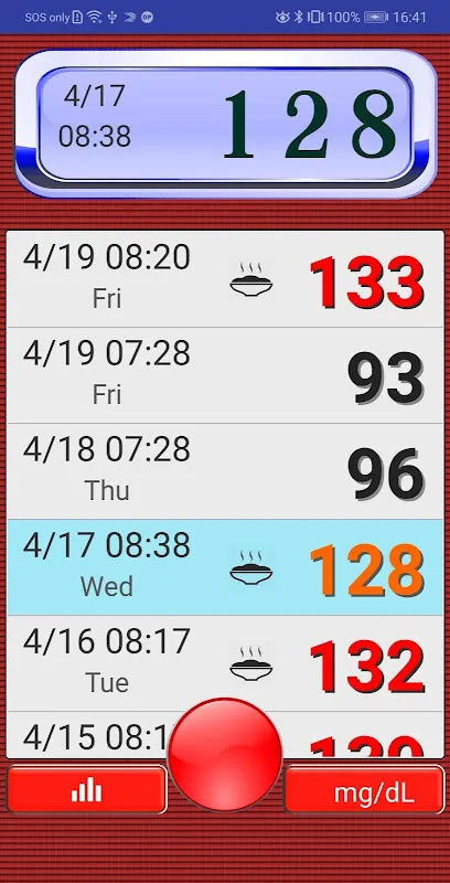
Yet perfection isn’t the goal – survival is. Weeks later, during stable mornings, its limitations glare. Exporting data to my endo requires manual CSV dumps into cloud folders, a process clunkier than fax machines. Trend analysis? Forget elegant sparklines. You get blunt, monochrome bar charts that look designed on a 1990s PDA. But in that taxi, as the timer hit zero and my retest showed 89 mg/dL glowing in serene green, I didn’t crave analytics. I craved certainty. And certainty arrived in 48-point Helvetica.
Flaws and FuryDon’t mistake simplicity for naivety. The absence of social features or meal databases isn’t oversight; it’s defiance. It assumes you’re an adult, not a data point. But this stubbornness breeds frustration. When I tried adding contextual notes during a high reading ("Possibly dodgy street food?"), the keyboard overlay shrank the critical glucose value to unreadable specs. A baffling oversight for an app obsessed with visibility! I cursed, slamming my palm against the mattress. For an app that masters crisis moments, it fumbles nuance. Yet when dawn highs hit, and my eyes refuse focus, its brutal minimalism feels like armor.
Now it lives permanently on my home screen – not as an app, but as a totem. Diabetes isn’t managed in spreadsheets; it’s fought in grocery lines, airport security, and flooded taxis. This tracker weaponizes constraint. It knows panic dissolves fine motor skills, so it gives you buttons a child could hit. It knows networks fail, so it treats connectivity as luxury, not necessity. That monsoon ride didn’t just introduce me to software; it revealed a philosophy: in the storm, complexity kills. Sometimes salvation is a giant, unwavering number telling you exactly what to do next.
Keywords:Blood Sugar Tracker,news,diabetes management,offline health tech,accessibility design


