Colorix Pro Saved My Renovation Sanity
Colorix Pro Saved My Renovation Sanity
That moment when you realize your entire color scheme is wrong mid-renovation hits like a bucket of paint to the face. I was knee-deep in swatches for our sunroom, surrounded by fading coral samples that looked perfect online but screamed "cheap motel bathroom" in daylight. My contractor's impatient sighs echoed as I frantically smeared sample pots across the wall, each stroke deepening my panic. The sunlight revealed undertones I hadn't anticipated - that serene seafoam green? More like radioactive pond scum under natural light. My phone buzzed with another "color decision yet?" text from my partner as I nearly cracked a paint can with my trembling foot.
The digital epiphany
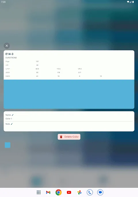
In desperation, I remembered that design podcast raving about some color wizardry app. Five minutes later, I was pointing my phone at the disaster zone. The first scan made me snort - the AR overlay looked like kindergarten finger-painting. But then I discovered the NCS Natural Color System integration, flipping through codes like S 2030-G40Y. Suddenly the wall transformed from nuclear waste to sophisticated olive haze. I physically jumped when I tapped RAL 230 50 35 - that elusive Mediterranean teal that had haunted my Pinterest board materialized instantly. The precision was unnerving; watching the virtual color adjust to afternoon shadows revealed subtleties impossible on paper swatches.
The real magic happened when I scanned our hideous terracotta floor tiles. Using the surface mapping feature, I tested how different wall colors would interact with that permanent orange menace. Seeing how a cool RAL 320 40 25 blue-gray neutralized the floor's aggression made me actually yelp. My contractor thought I'd cut myself with a palette knife until I shoved the phone in his face. His grudging "huh, that works" felt like winning the chromatic lottery. We spent the next hour digitally repainting the entire house, giggling like teens spray-painting trains as we made the hallway vomit neon pink just because we could.
When pixels betray
But the app wasn't all digital fairy dust. Testing colors at dusk became a cruel joke - the automatic white balance went haywire under artificial light, making elegant grays morph into hospital corridor beige. I nearly committed to what looked like a perfect warm taupe until dawn revealed it was actually corpse mauve. And the subscription model? Discovering basic RAL access cost extra after I'd mentally redecorated felt like paying ransom for my own color epiphany. That "free trial" notification should come with air raid sirens.
The final test came when we painted the actual walls. Holding my breath as the first roller stroke hit, I nearly cried when the physical paint matched the simulation. Not just close - identical. That visceral satisfaction of seeing pixels become reality can't be overstated. Though I'll admit checking the app obsessively for weeks afterward, pointing it at everything from my coffee mug to passing cars like some color-obsessed cyborg. My partner confiscated my phone during dinner dates when I started analyzing the RAL values of restaurant napkins.
Keywords:Colorix Pro,news,color visualization,home renovation,augmented reality


