Dawn's First Swipe: How +HOME Became My Digital Sanctuary
Dawn's First Swipe: How +HOME Became My Digital Sanctuary
The alarm's shriek tore through another Brooklyn pre-dawn. Bleary-eyed, my thumb fumbled toward the dismiss button on a screen that felt colder than the October air. Stock Android. Efficient? Sure. Soulful? Like a spreadsheet. That sterile grid of identical white icons against black void – it wasn't just a home screen; it was a mirror reflecting the monotony of my routines. I craved friction, texture, something that felt *mine* before the world demanded its piece of me. That desperation, that raw need for digital warmth, led me down the rabbit hole of launchers until my knuckles brushed against +HOME in the Play Store. "Free" it promised. "Customization" it whispered. I hit install, skeptical but starving for change.

What unfolded wasn't just decoration. It was a reconstruction. Opening +HOME felt less like launching an app and more like stepping into an architect's studio where my phone was the blueprint. The initial setup was disarmingly intuitive – no labyrinthine settings menus. Instead, it presented choices: fluid gestures replacing clunky taps, icon packs that weren't just reskins but complete aesthetic overhauls. I chose a pack mimicking hand-painted ceramics, each icon a tiny, imperfect glaze. Suddenly, my weather app wasn't a bland sun graphic; it was a miniature terracotta pot holding a digital succulent whose leaves subtly shifted with the forecast. The magic wasn't just visual; it was haptic. Scrolling between pages had a gentle, paper-like resistance. Tapping an icon offered a satisfying, muted *thunk* vibration, a tiny sensory confirmation in a world of silent interactions.
I became obsessed with the granularity. This wasn't slapping on a wallpaper. This was micro-surgery on the digital experience. +HOME exposed Android's underlying flexibility in ways stock launchers deliberately hide. I learned about adaptive icon masking – how the app intelligently reshapes disparate app icons into a cohesive visual language using masks defined by the chosen theme. My banking app’s garish logo was elegantly contained within a brushed copper circle. The chaotic mess of my social media folder became a neat grid of minimalist monochrome glyphs. The tech depth revealed itself subtly: how live wallpapers dynamically adjusted their parallax effect based on scrolling speed, or how the app cached theme elements locally to ensure buttery transitions even offline, a crucial detail for subway commutes. It felt like having root access without the risk of bricking my device.
One rainy Tuesday cemented its value. Stuck on a delayed L train, the gray gloom seeping into the carriage, I opened my phone. Instead of the usual sterile grid, I was greeted by a deep forest theme. Lush, animated foliage subtly swayed at the edges of the screen. The clock widget mimicked dappled sunlight filtering through leaves, the time displayed in elegant, wood-cut numerals. Tapping the music player icon didn’t just launch Spotify; it bloomed open like a night-blooming cereus, revealing controls etched onto a stylized leaf. That moment of unexpected digital serenity in the midst of urban chaos was profound. It wasn’t escape; it was recalibration. My phone, usually a source of stress pinged by notifications, became a pocket-sized grove.
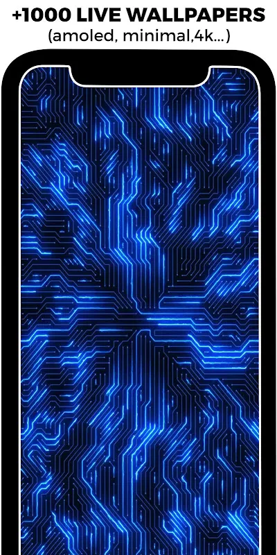
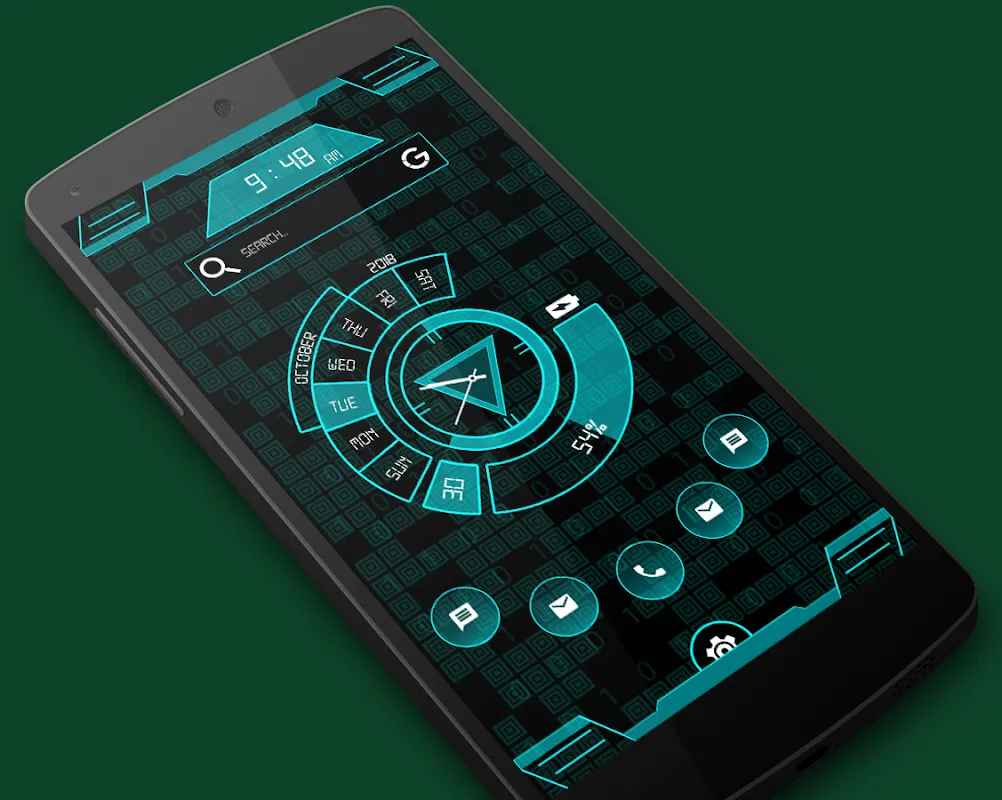
But gods, the sheer volume of themes! The discovery section was a double-edged sword. One evening, lost in a vortex of possibilities – cyberpunk neon grids, tranquil Japanese watercolors, brutalist concrete layouts – I hit decision paralysis. Choice overload is real. Scrolling through thousands of options felt exhilarating initially, then exhausting. Finding truly *great* themes required sifting through mountains of mediocre ones festooned with garish fonts and clashing colors. The search filters helped, but the curation felt algorithmic, not human. I longed for a "Hidden Gems" section curated by discerning designers, not just the most downloaded. This avalanche of choice is +HOME’s greatest strength and its most frustrating weakness. It demands patience, a willingness to dig.
And the resource hit? Noticeable, but not the dealbreaker some reviews scream about. On my mid-range Pixel, complex live themes with high-res assets and multiple parallax layers *did* shave maybe 5-7% off my battery by bedtime compared to stock. Animations, while gorgeous, could occasionally stutter if I had a dozen other apps jostling for RAM. It forced a kind of digital minimalism I didn’t know I needed. I ruthlessly pruned unused apps, stopped background processes for non-essentials. My phone became leaner, faster, *because* I demanded more beauty from it. A worthwhile trade, in my book. Sacrificing a sliver of battery for a daily dose of digital delight felt like bartering pennies for gold.
Now, unlocking my phone is a ritual, not a reflex. That first swipe up revealing my current theme – maybe a moody, rain-streaked cityscape at night, or vibrant abstract brushstrokes – sets the tone. It’s a tiny act of defiance against the generic, a reclamation of personal space in the digital sprawl. +HOME didn't just change my icons; it changed my relationship with the device. It transformed a utilitarian slab into something that sparks genuine, quiet joy several times a day. It proves that deep personalization isn't frivolous; it's fundamental to digital well-being. Finding that perfect theme, that seamless gesture, that tactile feedback that just *clicks* – it’s a small victory, intensely personal, and utterly satisfying. My phone is no longer just a tool; it’s the most personal gallery I own.
Keywords:+HOME,news,Android customization,digital mindfulness,UI personalization


