How Material UIX Saved My Sanity
How Material UIX Saved My Sanity
Rain lashed against my apartment window at 2 AM, the blue glow of Android Studio casting long shadows across my trembling hands. I’d spent seven hours wrestling with a dynamic color theming system that kept crashing when users uploaded profile pictures. My coffee tasted like battery acid, and my code resembled a Jackson Pollock painting—chaotic splatters of deprecated libraries and half-baked Material 3 implementations. Every time I thought I’d nailed the color extraction algorithm, the emulator spat out puce instead of violet. I nearly hurled my keyboard through the glass.
That’s when Dmitry’s Slack message blinked: "Try Material UIX. It eats dynamic color for breakfast." Skeptical but desperate, I added the dependency. Within minutes, I witnessed black magic. The toolkit’s pre-built ThemeBuilder swallowed my wall of configuration code whole, replacing 200 lines with three clean Kotlin functions. When I tested image-based theming, the palette generator extracted hues from a sunset photo with terrifying accuracy—deep maroons bleeding into gold, just like the reference design. For the first time in weeks, my shoulders unclenched. This wasn’t coding; it was sorcery disguised as an IDE plugin.
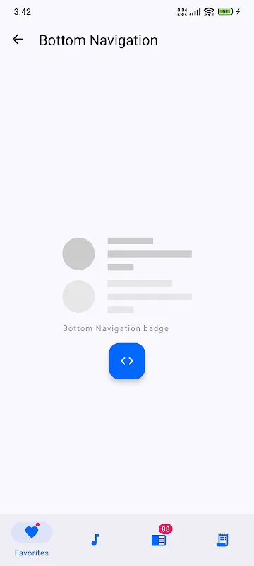
Next morning, I attacked our nightmare navigation bar. Material 3’s motion specs demanded fluid icon transformations during transitions, but my animations stuttered like a rusty hinge. Material UIX’s AnimatedNavigationComposable detected my struggle. Its underlying physics engine—built on SpringAnimation APIs—allowed me to tweak stiffness and damping with slider pre-sets. When I dragged the "bounciness" control rightward, the icons suddenly sprang to life, collapsing into the new shape with satisfying elasticity. The tactile joy of seeing immediate visual feedback made me cackle aloud. My cat bolted from the room.
But the toolkit’s dark side emerged during accessibility testing. Its automated contrast checker flagged our "deep ocean" button text as illegible against indigo backgrounds—something my sleep-deprived eyes missed. The anger returned when I discovered its WCAG compliance tools required manual color space conversions. For three furious hours, I wrestled with HSL calculations until realizing the library expected sRGB inputs. That oversight cost me half a Saturday. Still, when our VP praised the ADA-compliant UI later, I silently toasted Material UIX’s stubborn precision.
By week’s end, something shifted. Instead of dreading design reviews, I started prototyping with wicked glee. The toolkit’s component playground let me drag-drop FABs and cards like LEGO bricks while generating Kotlin DSL underneath. One evening, I animated a payment confirmation flow so smooth, my phone felt buttery. When the haptics pulsed in perfect sync with the expanding checkmark icon, I actually hugged my device. This cursed rectangle had become an extension of my creativity—all because a Kotlin DSL interpreter eliminated XML hell. My productivity soared, but my caffeine addiction? Unchanged.
Keywords:Material UIX,news,Android development,Material Design 3,Kotlin toolkit


