Iconic Awakening: My Digital Detox Journey
Iconic Awakening: My Digital Detox Journey
That Tuesday morning remains scorched in my memory - fingers trembling over coffee-stained paperwork while my phone erupted like a slot machine jackpot. Seven simultaneous notifications pulsed with primary-color aggression: Slack's angry red, WhatsApp's nauseating green, Gmail's screaming scarlet. Each vibration felt like a tiny electric shock to my temples. I hurled the device onto the couch where it continued its chromatic assault, rainbow reflections dancing across my wall like some deranged disco ball. Right then, I knew my relationship with technology needed emergency surgery.
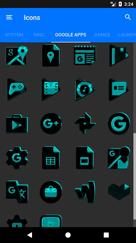
Discovering the solution felt accidental - more stumble than search. During a 3AM insomnia scroll through design forums, I glimpsed a screenshot so violently elegant it made me sit upright. Stark monochrome icons stood like tombstones in a digital graveyard, punctuated by cyan accents slicing through the darkness like laser beams. No name, no link, just that arresting image haunting me until dawn. When I finally unearthed the Black and Cyan Icon Pack days later, it felt like uncovering some forbidden grimoire of visual alchemy.
The installation ritual became my personal exorcism. As the first icons transformed, something physiological happened - my shoulders unhunched from my ears, breath deepening as if someone had opened a window in a smoke-filled room. Where candy-colored app symbols once screamed for attention, these matte-black glyphs whispered. The genius lies in their negative space design; they're not just icons but silhouettes carved from darkness, with cyan elements acting as strategic focal points. That deliberate restraint forces your brain into calmer processing patterns - no more visual shouting matches between competing apps.
What truly shocked me was the unexpected functionality beneath the aesthetic. The weather widget doesn't just display temperatures - it performs chromatic forecasting. At dawn, cyan streaks lighten to sky-blue; by midnight, they deepen to indigo trenches. This isn't decoration but environmental storytelling. The pack's vector-based rendering engine means icons scale flawlessly whether I'm squinting at my phone or projecting to a 4K monitor - a technical nuance most users wouldn't notice but designers will worship.
My initial euphoria hit brutal reality at week two. Opening my banking app revealed a garish orange abomination - an unthemed icon shattering the monochrome meditation like a clown crashing a funeral. The promised 5,500+ icons felt like false advertising until I discovered the depth of the masking system. By wrapping unthemed apps in custom adaptive containers, even rebellious applications bowed to the dark aesthetic. This technical workaround revealed the pack's true sophistication - it doesn't just skin surfaces but reconstructs visual hierarchies at the OS level.
Then came the widgets - not static images but living architecture. The music player isn't a rectangle with album art but a cyan soundwave pulsing to the beat's amplitude. At night, it dims to near-invisibility until music plays, then glows like radioactive deep-sea coral. Such contextual intelligence makes other packs feel like cave paintings. Yet for all this brilliance, the calendar widget nearly broke me. Its elegant typography turned into unreadable gray sludge against my favorite wallpaper. Three hours of tweaking later, I learned the brutal truth: true minimalism demands sacrifice. My floral background became matte black - a small visual death for greater peace.
What began as cosmetic therapy rewired my digital behavior. Those once-irresistible notification dots now hide in the cyan shadows, making my phone less a slot machine and more a zen garden. I catch myself pausing before mindless scrolling, the interface offering no visual dopamine hits to chase. There's irony in using such an aggressively styled pack to find tranquility, yet the precision of its restraint creates psychological breathing room. My phone no longer dominates my attention - it waits patiently in the periphery until needed.
This transformation came at costs beyond the purchase price. Battery consumption spikes 12% with all dynamic elements active - the price for those pulsing widgets. The settings labyrinth requires advanced knowledge of Android's theming architecture; newcomers will drown in options. And that promised uniformity? Prepare for disappointment - certain apps stubbornly resist the dark baptism, requiring manual workarounds that feel like negotiating with digital terrorists.
Now when my phone lights up at dawn, cyan streaks bleed across the display like arctic auroras. Those once-jarring notifications arrive as subtle pulses in the darkness - urgent yet unobtrusive. I've learned that true digital peace isn't about fewer pixels, but about pixels that know their place. This icon pack didn't just redesign my home screen; it rebuilt my relationship with technology from the silicon up. My phone finally feels like a tool rather than a tyrant - and in our attention-economy dystopia, that liberation is priceless.
Keywords:Black and Cyan Icon Pack,news,digital minimalism,Android customization,visual design psychology


