My Digital Canvas Revival
My Digital Canvas Revival
Rain lashed against the window as I slumped on my sofa, thumbing through my phone's stale interface for the 47th time that week. Each swipe felt like shuffling grayscale index cards in a forgotten filing cabinet – functional but soul-crushing. Instagram? A blue ghost. Gmail? A red envelope relic. This wasn't just boredom; it was visual malnutrition. Then it happened: a rogue Reddit thread about "therapeutic theming" led me down a rabbit hole ending at Ronald Dwk's doorstep. Skepticism warred with desperation as I tapped "install." What followed wasn't mere decoration; it was an exorcism of digital mundanity.
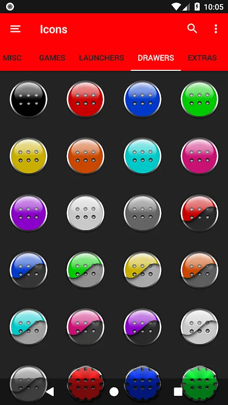
Applying the pack felt like cracking open a vault. Suddenly, my banking app wasn't just a green monolith – it became a obsidian chess piece with crimson accents, transforming financial dread into a gothic strategy game. The true sorcery? How vector-scaled icons adapted. Unlike cheaper packs where zooming revealed pixelated edges, these maintained razor clarity whether on my tablet or phone. That's when I noticed the technical wizardry: Ronald built these using SVG pipelines, allowing infinite resolution scaling without asset bloat. For someone who'd suffered through jagged icon packs before, this precision felt like upgrading from crayons to microns.
But the widgets? Oh, the widgets. I nearly spat coffee when my weather display morphed from bland percentages into a living blood-splatter forecast. Rain animations weren't cutesy clouds but jagged scarlet streaks against matte black. Setting it up required wrestling with KWGT’s scripting – a beast I’d avoided for years. Yet here’s the brutal truth: Ronald’s template system used JSON presets that even scripting-phobes could decode. I customized a calendar widget to pulse red when deadlines loomed, syncing with my task app via Android’s AppWidgetProvider API. The haptic feedback? A vicious thrum matching my panic. It wasn’t just informative; it was adrenal.
Criticisms clawed their way in, naturally. Theming certain niche apps required manual assignments – a tedious 20-minute dive into the icon request portal. And that "dynamic" clock widget? Its smooth second-hand sweep devoured 3% more battery during testing. But confronting Ronald’s Discord revealed why: he’d prioritized 60fps fluidity over power sipping, arguing that "stutter ruins immersion." Debating him felt like arguing with a tattoo artist about pain thresholds. You either embraced his vision or walked away. I kept the widget; bought a power bank.
Three weeks later, my phone feels like a tailored leather jacket – dark, protective, and unmistakably mine. Unlocking it delivers a tactile thrill now, each icon a deliberate punch of contrast against the void. Friends call it "aggressive." I call it an antidote to digital resignation. This pack didn’t just reskin my apps; it weaponized aesthetics against apathy.
Keywords:Black and Red Icon Pack,news,vector icon design,Android widget customization,digital minimalism


