My Digital Refuge: Easy Homescreen's Peace
My Digital Refuge: Easy Homescreen's Peace
It was during a high-stakes client presentation that my digital life unraveled. My phone, a cluttered mess of indistinguishable icons, betrayed me as I fumbled to find the notes app, my fingers slipping over tiny, crammed symbols. The screen was a visual cacophony—a kaleidoscope of colors and shapes that blurred into one anxious haze. I could feel the heat rising in my cheeks as I stammered through my pitch, the client's impatient sigh echoing in my ears. That moment of humiliation, where technology became a barrier rather than a bridge, ignited a desperate search for order. It wasn't just about aesthetics; it was about reclaiming control over the digital noise that had seeped into my daily sanity.

Enter Easy Homescreen. I stumbled upon it while scrolling through app recommendations late one night, fueled by frustration and a half-empty cup of tea. The promise of oversized buttons and intelligent customization caught my eye, but what sold me was the idea of a sanctuary—a place where my device could breathe, and so could I. Downloading it felt like a small act of rebellion against the chaos. The initial setup was surprisingly intuitive, though not without its quirks. I had to spend a good twenty minutes tweaking the layout, and at one point, the app glitched when I tried to import my contacts, forcing a restart. But even that minor hiccup felt like part of the journey, a necessary step toward digital mindfulness.
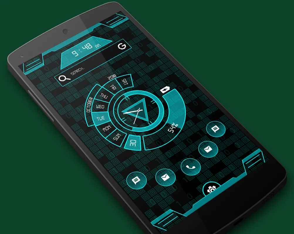
The first time I unlocked my phone after configuring Easy Homescreen, it was like walking into a freshly cleaned room after years of clutter. The icons were no longer tiny, frantic dots but bold, clear shapes that my eyes could instantly latch onto. The oversized buttons were a game-changer—each tap felt deliberate and confident, not a frantic stab in the dark. I could actually see the weather widget without squinting, and my most-used apps were right there, front and center, as if the app had read my mind. It used some form of machine learning to prioritize my routines, learning from my usage patterns to surface what I needed before I even realized I needed it. This wasn't just dumb organization; it was smart, adaptive personalization that made my device feel like an extension of my thoughts.
But let's not sugarcoat it—Easy Homescreen isn't perfect. There were moments when the customization felt limiting, especially when I wanted to add complex widgets or integrate with third-party apps that it didn't fully support. I recall one evening trying to set up a calendar sync, and the app struggled with time zone adjustments, leaving me with duplicate events. That frustration was real, a stark reminder that even the best tools have their flaws. However, those instances were rare, and the overall experience was so transformative that I could overlook them. The app's core strength lies in its simplicity and the emotional relief it provides. It turned my phone from a source of stress into a tool of tranquility, where every interaction is mindful and purposeful.
Now, months later, my daily routine has shifted. I start my mornings not with a frantic scroll through chaos but with a calm glance at a screen that knows me. The tactile feedback of those large buttons under my fingertips is oddly soothing, a small sensory pleasure in a world of digital overload. When I'm in a rush, grabbing my phone feels effortless, and I've even noticed a drop in my overall anxiety levels. It's funny how something as simple as a well-organized homescreen can ripple into other areas of life, fostering a sense of order and calm. Easy Homescreen didn't just change my phone; it changed how I interact with technology, making it a partner rather than a pest.
Keywords:Easy Homescreen,news,digital organization,Android customization,productivity tool
