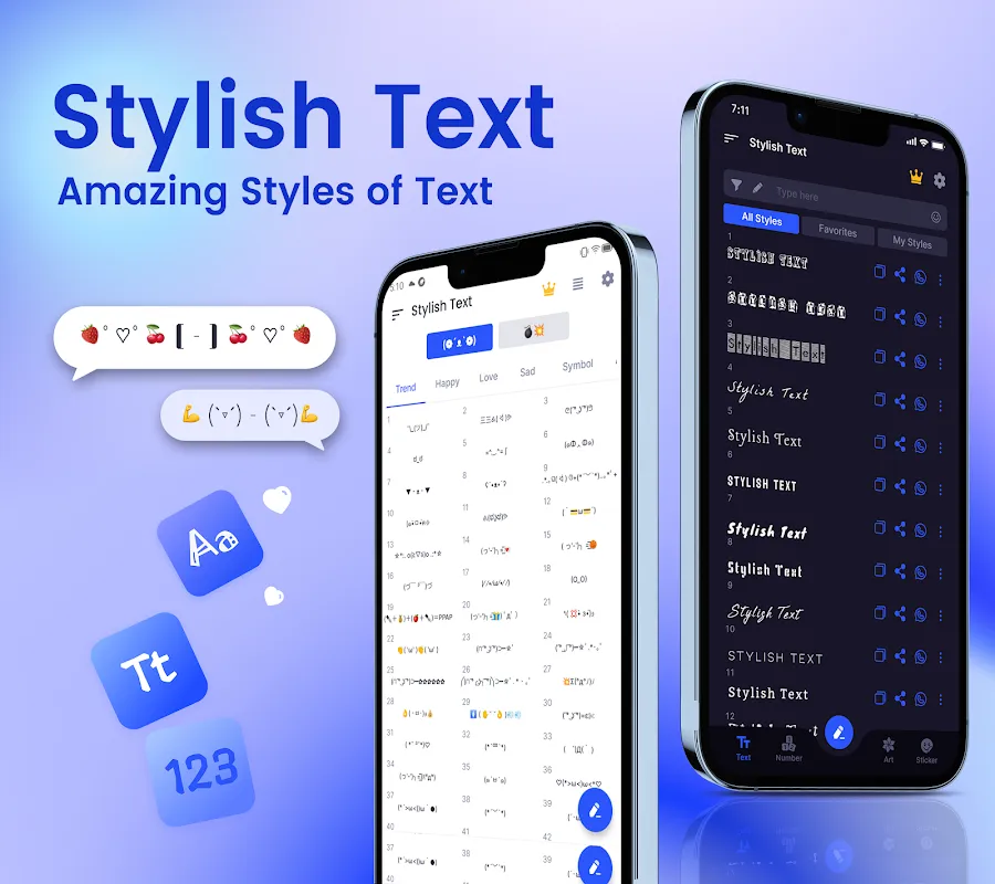
My Font Revolution: Breaking Social Monotony
My Font Revolution: Breaking Social Monotony
Scrolling through Twitter last Tuesday felt like staring at a hospital corridor – sterile, repetitive, soul-crushingly beige. Every bio read like carbon-copy obituaries: "Coffee lover ✨ Travel enthusiast ? Dog mom ?". My own profile? A monument to mediocrity. That's when my thumb, moving on pure desperation, stumbled upon the app store's equivalent of a neon sign in a graveyard.
The transformation began with hesitation. I typed my mundane name – "Emily" – into that first blank field. What happened next felt like digital alchemy. Suddenly, my identity wasn't just letters; it became ????? with swirling tails that seemed to dance between the screen pixels. My breath actually hitched when I saw it rendered live. This wasn't typing; it was conjuring. Each tap summoned ancient runes, futuristic glyphs, and playful bubbles that defied every font rule my high school typing class ever drilled into me. The app didn't just change text; it rewired my perception of digital selfhood.
Late into that first night, I became a mad scientist in my dimly lit bedroom. The app's real magic lies in its Unicode manipulation – that invisible backbone of digital text. Every "a" could transform into ?, ?, or even ? through clever character substitution. I learned that these fancy symbols aren't images but specific code points in the Unicode standard, mapped and organized with terrifying efficiency. When you select "Gothic" style, you're essentially activating a parallel alphabet where A isn't U+0041 anymore but U+1D504. This technical sorcery happens faster than my brain can process the tap, translating my boring keystrokes into visual poetry. The database must contain thousands of character variations, indexed for instant retrieval – a feat that still makes my programmer friend mutter about "black magic".
But oh, the frustration when ambition outpaced reality! Trying to craft the perfect Instagram caption became a battlefield. I'd spend 20 minutes designing ɱყ ოυɾƚҽαƙ ʂαɳԃɯιƈԋ ?✨ only to watch it crumble into question marks on my friend's Android. Unicode compatibility issues turned my artistic triumph into digital hieroglyphics. I actually screamed into a pillow when my meticulously crafted ???????� ?????! became "Birthda? pa?ty!" on Grandma's tablet. The app gives godlike power until platform limitations smack you back to reality – a brutal reminder that digital expression remains a fragmented landscape.
Victory tasted sweetest during my gaming clan's recruitment drive. While others posted generic "JOIN US!!!" messages, my announcement pulsed with otherworldly energy: ⚔️ ???? ??? ????? ????? ⚔️. Recruitment tripled overnight. New members confessed they clicked purely because the text "looked like it was breathing." My Discord transformed into a carnival of typography – ???? ???? became a medieval scroll, raid strategies gleamed with ✧・゚*✧sparkles✧・゚*✧, and even mundane server rules gained authority with ?? ???? ?? ???. The psychological impact was measurable: engagement skyrocketed when messages carried visual weight beyond their semantic meaning.
Now I catch myself judging restaurants by their menu typography. That new bistro using plain Calibri? Pass. But the café with ₊˚ʚ ᗰᗩᑕᕼᗩ ᗰᗩGIᑕ ɞ˚₊ on their chalkboard? Take my money. This app rewired my visual cortex – I see boring fonts as personal insults. When my bank sent a "security alert" in Comic Sans, I nearly closed my account on principle. The tool taught me that typography is emotional architecture; every curve and serif manipulates perception before a single word is processed.
My crowning achievement came during a depressive slump last month. Opening Instagram felt like wading through tar. Then I redesigned my bio: ⋆ ˚。⋆୨୧˚ ????????? ??? ??? ୨୧˚。⋆ ⋆. Seeing those resilient letters – some bold, some delicate, all defiantly ornate – became my daily armor. Strangers DMed saying the aesthetic gave them hope. Who knew that ????? ???? could be existential medicine?
This morning I caught my reflection smiling at a notification. My pharmacy app usually triggers dread, but their "Rx ready" alert now floats in as ✧・゚: *✧・゚:* ???? ???? ??? ??????? *:・゚✧*:・゚✧. The app has colonized my digital existence, turning transactional moments into miniature art installations. This typography revolution proves that self-expression hides in the spaces between letters – and I've only begun exploring the frontier.
Keywords:Stylish Text Cute Fonts Style,news,digital self expression,unicode typography,social media personalization


