My Fonts Keyboard Journey
My Fonts Keyboard Journey
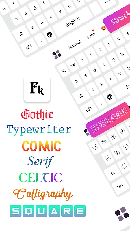
I remember the day I first stumbled upon Fonts Keyboard like it was yesterday. I was sitting in a dimly lit café in downtown Seattle, the rain pattering against the window, and I felt utterly uninspired. My Instagram feed had become a monotonous stream of identical captions—same old fonts, same lack of personality. As a freelance writer, my online presence is my portfolio, and it was bleeding into beige. That’s when I saw a friend’s story with these whimsical, curled letters that looked like something out of a fairy tale. My curiosity piqued, I dove into the app store, and there it was: Fonts Keyboard. The promise of "cute fonts art" felt like a lifeline.
The First Tap
Downloading the app was swift, but the real magic began when I granted it keyboard permissions. I’ll admit, I felt a twinge of hesitation—handing over keyboard access always sketches me out. But the setup was surprisingly intuitive. Within minutes, I was scrolling through a gallery of fonts that ranged from elegant scripts to playful bubbles. The first time I typed a sentence and saw it transform into a delicate, calligraphic style, my heart did a little flip. It wasn’t just text; it was art. The app uses a combination of Unicode mapping and custom glyph libraries to render these fonts, which means it’s not just slapping on a new typeface—it’s actually converting characters into stylistic variants that most platforms recognize. This technical nuance hit me when I pasted my first styled text into Instagram: it held up perfectly, no glitches.
But let’s talk about the flaws, because nothing’s perfect. The free version is ad-supported, and those pop-ups? They’re like uninvited guests at a party. I was in the middle of crafting a heartfelt post about my grandmother’s birthday, and bam—an ad for a game I’ll never play. It shattered the mood. Yet, the core functionality is where this font tool shines. The ability to copy-paste styled text across apps is seamless, thanks to its integration with system clipboards. I spent an hour experimenting, and each font felt like a new outfit for my words.
A Night of Frustration and Triumph
The real test came when I decided to revamp my LinkedIn profile. I wanted to add a touch of creativity to my headline without seeming unprofessional. Fonts Keyboard offered a "classy" section with serif fonts that had just the right amount of flair. But here’s where I hit a wall: some fonts displayed as blank boxes on LinkedIn’s web interface. Panic set in. Was I about to look like I’d pasted gibberish? After some digging, I realized it’s a platform limitation—not all social media sites support every Unicode block. The app could do a better job warning users about compatibility, but its preview feature saved me. I could test fonts in a sandbox before committing. That night, I felt a rollercoaster of emotions: frustration at the limitations, but triumph when I found a compatible font that made my profile stand out. It was like solving a puzzle, and the technical insight—understanding how font rendering works across different APIs—made me appreciate the app’s engineering.
What truly amazed me was the sensory experience. Tapping through the font list, I could almost feel the texture of each style—the sharp edges of a modern sans-serif, the soft curves of a handwritten script. It’s not just visual; it’s tactile, even though I’m swiping on glass. I remember using a bubbly font for a friend’s baby shower invitation, and the responses flooded in: "How did you do that?" It became a conversation starter. But let me vent about the keyboard lag occasionally. When I’m typing fast, the app sometimes stutters, especially with richer fonts. It’s a minor gripe, but in moments of inspiration, it feels like hitting a speed bump.
The Turning Point
The pinnacle was when I used Fonts Keyboard for a personal project—a digital scrapbook for my partner’s anniversary. I wanted every word to ooze emotion. The app’s "artistic" fonts, with their swirls and shadows, turned simple messages into love letters. I delved into the technical side: how the app layers characters with combining diacritics to create depth. It’s not magic; it’s clever coding. But oh, the frustration when I accidentally deleted a styled paragraph because the undo function is finicky. I nearly threw my phone. Yet, the joy of seeing the final product—a collage of text that felt alive—was worth the hair-pulling moments. That’s the thing about the keyboard app; it’s a companion in creativity, flaws and all.
Reflecting on months of use, I’ve had highs and lows. There was the time I used a gothic font for a Halloween post and watched engagement skyrocket—people loved the novelty. But also the disappointment when an update removed my favorite font pack. The developers listen, though; they rolled it back after user feedback. This app has taught me that technology isn’t just about functionality; it’s about emotion. Every font choice is a mood, a statement. And Fonts Keyboard, for all its quirks, has become my go-to for injecting soul into my digital life.
Keywords:Fonts Keyboard: Cute Fonts Art,news,social media enhancement,font customization,user experience


