My Glassy Digital Sanctuary
My Glassy Digital Sanctuary
That Tuesday morning glare felt personal. Sunlight sliced through my bedroom window, spotlighting every jagged edge on my phone's home screen like a cruel museum exhibit. I counted seventeen different icon styles before my coffee kicked in - corporate blues battling neon game logos while some fitness app screamed lime green. My thumb hovered over Instagram's candy-colored atrocity, and something snapped. Not the screen. Me.
Three app stores and forty minutes later, I stabbed "install" on Grey Glass Orb like signing a peace treaty. The initial setup had me sweating - Nova Launcher's settings felt like defusing a bomb where wrong wires meant cartoonish icons might survive the purge. When the apply button finally gulped down my tap, the transformation wasn't gradual. It was architectural. Suddenly my banking app wasn't shouting money-green aggression but whispering through textured frost like cathedral glass. That first unified scroll felt like wiping steam off a mirror to find a better reflection.
What they don't tell you about frosted aesthetics? They react to light like living things. That afternoon, sunlight hit my weather widget just as precipitation animations triggered - fractals of virtual ice catching real photons. Behind that beauty lies serious rendering tech: alpha channel manipulation creating depth without crushing battery life. Each icon's subtle shadow layer uses ambient light algorithms similar to iOS's dynamic wallpapers, but here they serve visual harmony instead of corporate branding.
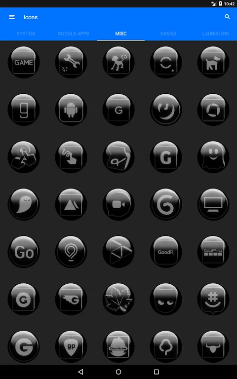
Not all was crystalline perfection though. Day two revealed Grey Glass Orb's dirty secret - its sheer abundance. Scrolling through 7600+ icons felt like drowning in a Tiffany's catalog. Finding the perfect calendar icon took longer than my actual scheduling. And when my niche Czech transit app stayed stubbornly unthemed? I nearly rage-uninstalled until discovering the manual override - a feature buried so deep it felt like the devs were ashamed of it. The patchwork solution stained my pristine layout like ink on snow.
But oh, the moments of grace. Unlocking my phone during a stressful commute to see notifications materialize like frost patterns on a winter window. Watching widgets breathe - literally expand and contract with content updates through clever CSS animations masked as physics. That smug thrill when colleagues asked if I'd jailbroken my Android. "Just a little glass alchemy," I'd shrug, hiding how many hours I'd spent obsessively tweaking folder transparency.
By week's end, something unexpected happened. My compulsive app-hopping decreased. That uniform frost layer created friction - no more dopamine hits from candy-colored distractions. Opening Spotify required intentionality, like turning a heavy glass knob. The aesthetic discipline bled into my workflow; I started blocking social media during deep work hours. Who knew visual consistency could function as digital Ritalin?
Does it transform your digital life? Absolutely. Is it flawless? Hell no - I've got screenshots of that Czech transit icon glaring like a drunk uncle at a wedding. But when twilight hits my widgets just right, casting long lavender shadows across perfectly aligned glass orbs? That's not interface design. That's visual therapy.
Keywords:Grey Glass Orb Icon Pack,news,icon customization,minimalist design,Android personalization


