My Home Screen's Monochrome Awakening
My Home Screen's Monochrome Awakening
That Tuesday morning chaos hit differently. I'd spilled coffee on my notes while simultaneously missing a calendar alert – the third time that week. My phone's screen glared back: a vomit of candy-colored icons, mismatched notification badges, and a calendar widget stuck on yesterday's date. Pure visual cacophony. My thumb hovered over the app store icon like a detonator, fueled by sheer frustration at the pixelated clutter mocking my productivity.
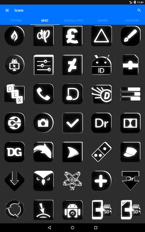
Installation felt like shedding a skin. The 5600+ icon library wasn't just comprehensive – it was obsessive. Every niche app from my password manager to that obscure plant-care tracker transformed into elegant silhouettes. Applying them through Nova Launcher became a ritual: each replaced icon a tiny victory against digital noise. That first moment seeing my home screen? Pure silence. Stark black shapes on white, like chess pieces on a board. My breathing actually slowed.
Then came Wednesday's magic trick. I woke to see my calendar icon displaying "17" – the actual date. No manual refresh, no widget reset. Just dynamic calendar integration working silently overnight. It seems trivial until you've wasted minutes weekly updating decorative elements that should just function. The precision felt almost rebellious in our era of bloated apps demanding constant attention.
But perfection stumbled on Thursday. My banking app remained a garish red eyesore – unthemed in the pack. That single discordant note made my zen grid feel incomplete. I fired off a terse email to Ronald Dwk expecting radio silence. Woke Friday to an update notification: my banking icon now a crisp monochrome vault. Turns out, obsessive curation extends beyond initial design to community responsiveness. My criticism dissolved into sheepish admiration.
There's brutality in this minimalism. The pack strips away every decorative pretense – no gradients, no textures, just essential forms. It forces you to confront your app usage honestly. That colorful game I opened 20 times daily? Its stark black controller icon revealed my avoidance patterns. The visual consistency became a mirror, exposing digital habits I'd camouflaged with aesthetic chaos.
Now my phone feels like a tool, not a slot machine. Each tap is deliberate. The monochrome aesthetic didn't just organize my apps – it recalibrated my attention span. And that dynamic calendar? Still updates flawlessly, a tiny daily reminder that good design works quietly in the background while you live in the foreground.
Keywords:Flat Black and White Icon Pack,news,minimalist design,dynamic icons,home screen optimization


