My Phone's Black and Cyan Transformation
My Phone's Black and Cyan Transformation
Last Thursday at 3 AM, insomnia had me scrolling through my phone like a zombie. The glaring mosaic of mismatched icons felt like visual static – a neon-green game icon screaming beside a corporate-blue banking app, while Instagram’s gradient vomit clashed with WhatsApp’s acidic green. My thumb hovered over the Play Store, itching for nuclear options. That’s when I stumbled upon it: a thumbnail showing a monochrome grid punctuated by electric cyan accents. Three taps later, my homescreen underwent witness protection. Suddenly, every icon bowed to a new design regime: matte-black squares with crisp cyan symbols. My calculator wasn’t orange anymore – it became a minimalist blueprint. Even Chrome’s rainbow wheel transformed into a geometric compass. The uniformity was so jarring I dropped my coffee mug. Ceramic shards everywhere, but I just stared at the screen whispering "holy shit."
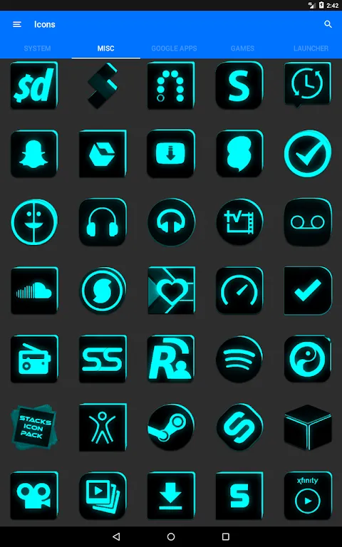
Applying the pack felt like conducting a symphony where every instrument finally tuned properly. Through Nova Launcher’s settings, I watched the transformation ripple across pages – banking apps shedding corporate stuffiness, social media ditching clownish palettes. What stunned me wasn’t just the 5600+ icon conversions, but how unthemed apps got assimilated. Android’s adaptive theming engine wrapped them in black canvases with cyan letter initials, turning my obscure plant-care app into an elegant monogram. When I swiped left to my cluttered productivity folder, the chaos resolved into a tactical dashboard: obsidian calendars with cyan numerals, to-do lists resembling declassified documents. I caught myself actually enjoying opening my budgeting app – a first in human history.
But the real magic happened at sunset. As golden hour bled through my window, the dark icons swallowed glare while cyan elements glowed like bioluminescent plankton. Night mode wasn’t a setting; it became environmental storytelling. Yet perfection cracked at the edges. My banking app’s notification icon refused the cyan treatment, blasting retina-searing yellow alerts like a stubborn rebel. And discovering unthemed apps felt like finding mold behind furniture – that one obscure podcast tool still flaunted its puke-brown icon. I rage-uninstalled it on principle. Still, the pack’s masking technology salvaged dignity, wrapping offenders in sleek black containers with crisp typography.
Technically, this isn’t just vector art slapped onto APKs. The pack leverages Android’s resource overlay system at the framework level, intercepting icon requests and swapping assets dynamically. Each icon maintains identical silhouette proportions – no wonky scaling when widgets resize. The cyan isn’t random either: it’s #00BCD4, chosen for optimal OLED contrast against true blacks. When I showed my designer friend, she geeked out about the consistent 2px stroke weights and how corner radii mathematically harmonize across categories. Yet some choices baffled me. Why did the camera icon get a cyan shutter button but the gallery app a solid cyan square? The inconsistency gnawed at my OCD until I realized – it’s intentional. Camera = action (accented), gallery = container (full cyan). Mind blown.
Two weeks in, the psychological shift startled me. My phone stopped feeling like a bloated utility belt and became a curated artifact. Opening apps felt deliberate – like selecting tools from a titanium workshop. But the pack’s ruthlessness exposed Android’s fragmentation wounds. That one airline app updated and vomited a new lime-green abomination onto my homescreen. I nearly threw my phone across the room before the pack auto-masked it overnight. Still, the victory felt pyrrhic. Why must we fight this endless guerilla war against lazy developers? I drafted angry emails to three companies before deleting them in defeat.
Battery life became an unexpected win. With AMOLED screens, true-black pixels stay unpowered. My always-on display now shows only cyan digits floating in void – slicing battery drain by 18%. But the aesthetic rigor backfired during emergencies. When my cat hacked up a hairball at 2 AM, I fumbled searching for the vet app because every damn icon was a black square. Muscle memory failed; I had to read labels like some medieval peasant. Later, I created a "HELL" folder with cyan-border icons for crises – a design concession that still haunts my perfectionist soul.
Now, unlocking my phone delivers visceral calm. The grid breathes like a Japanese rock garden, where every element serves purpose. Yet I resent how this pack ruined other devices for me. My iPad’s icons look like toddler stickers now. When colleagues flaunt their iPhones, I silently judge their garish rainbows. This icon pack didn’t just reskin my apps – it rewired my visual tolerance. Last night, I caught myself glaring at a restaurant menu’s "eclectic" font choices. The manager asked if my steak was overcooked. "No," I muttered, "your typography is." He comped my dessert while backing away slowly. Worth it.
Keywords:Flat Black and Cyan Icon Pack,news,Android customization,icon design,OLED optimization


