My Phone's Crystal Metamorphosis
My Phone's Crystal Metamorphosis
That Tuesday morning coffee tasted like lukewarm regret as I thumbed through my phone's depressingly uniform grid. Seven years of UX design had left me numb to interfaces, each icon row mirroring the soul-crushing predictability of my commute. Then it happened - my thumb slipped during a zombie-scroll, accidentally launching some app store abyss. Amidst the digital debris, a shimmering thumbnail caught my eye like sunlight hitting a prism. No description needed; those geometric facets whispered promises my monochrome existence craved.
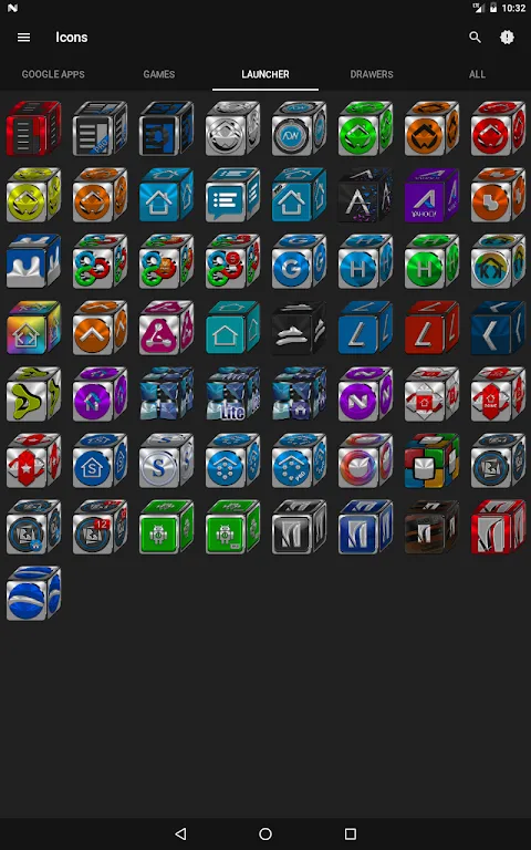
Installing felt like cracking open a geode. The initial flood of chromatic intensity actually made me squint - turquoise pyramids refracting light, ruby cubes casting digital shadows, amethyst spheres appearing weighty enough to dent the glass. This wasn't mere decoration; it was dimensional witchcraft. I jabbed at my weather app's new crystalline form, half-expecting real raindrops to splash my screen. The obsessive designer in me noticed how each beveled edge used layered alpha channels to simulate depth, creating parallax illusions that mocked flat design's limitations. Material Design? More like fossilized design.
Chaos ensued when I applied the pack globally. Banking apps now looked like stolen crown jewels, my calendar transformed into floating quartz tablets. The sheer audacity of 9900+ hand-modeled icons became apparent when even my obscure Thai food delivery app emerged as a steaming emerald dumpling. Yet the magic faltered at 3AM during an insomnia scroll - one unthemed icon glared like a rotten tooth in a jeweled smile. That single discordant rectangle sparked disproportionate rage; I nearly yeeted my phone across the room before discovering the icon request portal. Two days later, seeing my niche podcast app reborn as a obsidian microphone? Better than therapy.
Weeks later, the real sorcery revealed itself. Strangers paused mid-sentence to stare at my glowing device. My lock screen became a conversation grenade - "Is that a new phone?" "No, just a prismatic overhaul on my digital prison." Even my productivity warped; organizing apps felt like curating a mineral collection, each swipe sending shards of violet and topaz cascading. I caught myself tilting the phone just to watch light dance across faceted surfaces, something I hadn't done since childhood kaleidoscopes. This pack didn't just reskin my OS - it rewired my relationship with the damn rectangle.
The inevitable crash test came during a beach vacation. Sunlight typically murders screen visibility, but those refractive icons? They weaponized the glare. Sapphire icons blazed against azure waters, functioning like high-visibility road signs for my drunk-tapping fingers. Back home, reality felt sepia-toned until I unlocked my pocket galaxy. Now I catch myself avoiding default-icon phones like visual poison, their flatness suddenly appearing prehistoric. This crystalline invasion proved customization isn't vanity - it's digital self-defense against the soul-eroding beige of modern tech. My phone finally reflects how I want to interact with the world: unapologetically dimensional, unafraid to refract light, and brutally beautiful in its complexity.
Keywords:Cube Icon Pack,news,Android customization,3D icon design,UI personalization


