My Phone's Dazzling Metamorphosis
My Phone's Dazzling Metamorphosis
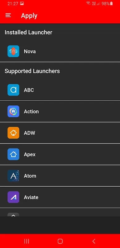
That Monday morning felt like wading through digital sludge. I thumbed through my phone's home screen – a wasteland of corporate blue squares and soulless gradients. Instagram's camera icon glared at me with sterile perfection. Gmail's envelope looked like it was stamped by a government printer. Even the wallpaper I'd painstakingly chosen seemed drained of life beneath this avalanche of visual monotony. My thumb hovered over the app store icon, possessed by a sudden, visceral need to smash this aesthetic prison.
The transformation happened at 2:37 AM during a fit of insomnia-fueled scrolling. When the first jewel-toned icons loaded, I physically jerked back from the screen. Chrome wasn't a yellow circle anymore – it became a fractured sunbeam captured in amber glass. The phone dialer transformed into a sapphire teardrop with light dancing in its depths. Each icon felt like a tiny artifact from some futuristic cathedral, their refractive surfaces responding to my screen's brightness in real-time. I spent twenty minutes just tilting my phone under my desk lamp, mesmerized by how the shadows danced inside Google Maps' emerald continents.
By dawn, my device felt like borrowed alien technology. Opening Spotify revealed a garnet soundwave suspended in smoked glass – I caught myself tapping it gently, half-expecting a chime. The real magic hit during my commute: sunlight streamed through the train window, making my banking app's golden vault shimmer like actual bullion on my screen. A stranger actually nudged me asking what "that liquid crystal display" was. The illusion was so complete I instinctively wiped fingerprints off my weather app's raindrop, forgetting it was just pixels.
Then came Wednesday's reckoning. My niche language learning app remained stubbornly unchanged – a pixelated sore thumb amidst the crystal symphony. That ugly duckling icon became my personal torment, glaring at me every time I swiped past. When I finally located the icon request form buried three menus deep, I typed with the fury of a jaded art director. Imagine my shock when Ronald Dwk's team responded within hours with a custom-crafted amethyst book icon. Their solution involved extracting color profiles from my wallpaper to match the glass texture – a detail-obsessed touch that almost made me forgive the clunky submission process.
Now I catch myself powering up my phone just to watch light cascade across the app drawer. That tactile satisfaction when my finger glides over the camera's ruby lens? Pure dopamine. Yet I still curse whenever system apps revert to stock icons after updates – a jarring betrayal that feels like finding mold on wedding cake. This isn't decoration; it's alchemy. My phone went from utilitarian brick to pocket-sized stained glass window, and I'll never look at app design the same way again.
Keywords:Colorful Glass ONE UI IconPack,news,visual customization,icon design,user experience


