My Phone's Rebirth with +HOME
My Phone's Rebirth with +HOME
Rain smeared across my office window like dirty fingerprints when I finally snapped. My thumb hovered over the same static grid of corporate blues and productivity grays - that damn calendar icon mocking me with its relentless reminders. Enough. I'd rather chew glass than endure another Zoom call staring at this soul-crushing interface. Scrolling through app stores felt like digging through digital landfill until +HOME's preview images punched through the monotony: liquid gold icons swirling against midnight purple, animations that breathed like living stained glass. I downloaded it like throwing a Molotov cocktail at my own boredom.
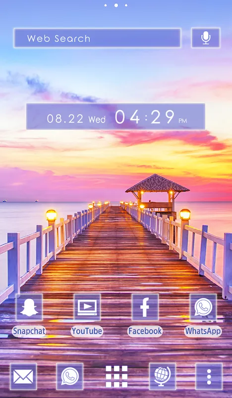
First boot felt like cracking open a geode. The default "Serenity" theme washed my screen in gradient seafoam greens, each app icon reshaped into smooth pebbles that rippled when touched. But the real witchcraft happened when I dove into the theme editor. Not just slapping on wallpapers like band-aids - this thing let me rewrite my phone's DNA. Found the "Physics Engine" toggle buried in advanced settings. Turned it on and suddenly my app drawer became a kinetic sandbox: icons wobbled with gyroscopic tilt, folders expanded like blooming flowers when tapped. My inner nerd geeked out discovering it uses real Box2D physics libraries - same stuff powering indie mobile games. Yet here it was, making my grocery list app bounce like a happy puppy.
Wednesday morning disaster struck. Chose some "Cyberpunk Neon" monstrosity that turned my notification bar into a seizure-inducing rave. Purple text bled into violet backgrounds making messages unreadable. Nearly rage-uninstalled when I couldn't find settings - until discovering the pinch-to-zoom gesture on the home screen secretly activates "Depth Mode." Suddenly all elements layered like 3D cards, parallax shifting as I tilted the phone. That hidden genius saved our relationship. Spent lunch break crafting my "Deep Forest" theme: weather widget dripping with animated rain, app icons as textured mushrooms growing from digital soil. Made my banking app look like a poisonous toadstool - fitting.
By Friday, customization became meditation. The haptic feedback tuning alone - oh god. Dialed it down to a butterfly-kiss vibration for notifications, cranked it to bone-rattling thumps for alarms. Discovered you can set different feedback patterns per app: Morse-code taps for texts, rolling thunder for emails from my boss. The precision reminded me of adjusting a mechanical watch - tiny screws governing tactile poetry. My phone stopped being a slab of glass and metal. It purred. It pushed back. It developed quirks - like how the clock widget's cuckoo bird would sometimes emerge upside-down after heavy multitasking. Glitches became personality traits.
Now when I unlock my device, the screen blooms like time-lapse footage. Calendar notifications unfurl as origami cranes. Slack's toxic green icon got banished to a minimalist monochrome folder. This launcher didn't just reskin my phone - it performed digital psychoanalysis. Every swipe feels like turning pages in a grimoire where I'm both wizard and apprentice. Still hate my job. But now when the 3pm existential dread hits? I swipe left to my "Lava Lamp" screen and watch gelatinous blobs ooze across notifications. Small rebellions matter. Especially when they fit in your pocket.
Keywords:+HOME,news,interface customization,interactive themes,haptic feedback


