My Phone's Silent Rebellion Against Blandness
My Phone's Silent Rebellion Against Blandness
That Tuesday morning espresso tasted bitter as I watched my colleague's fingers dance across his iPhone's pristine grid. "Customization?" he'd snorted when I mentioned Android. "It's just messy chaos." His words echoed in the silent elevator ride down, my thumb hovering over the same monochrome icons I'd tolerated for years - a visual purgatory between corporate uniformity and genuine self-expression. That night, I declared war on my home screen's soul-crushing sameness.
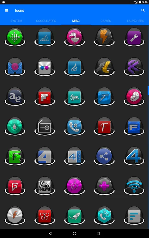
Initial skirmishes were disastrous. One icon pack demanded ritualistic incantations just to apply a folder icon. Another promised "thousands" but delivered twelve variations of the same email symbol. Each failure felt like betrayal - wasted hours resurrecting default setups after uninstalling apps that treated my phone like their personal graffiti wall. My gallery filled with screenshots of near-misses: almost-cohesive themes ruined by one neon-green calculator icon screaming discordance like a drunk at a symphony.
Then came the breakthrough during a midnight scroll. The installation felt different - no permissions begging for my contacts or location, just clean efficiency. Within minutes, my screen underwent metamorphosis. Frosted glass icons materialized with weightless depth, catching light at angles that made them feel tangible. I'd later learn this witchcraft was vector-based adaptive rendering, scaling seamlessly across resolutions where lesser packs pixelated like 8-bit artifacts. For the first time, my Android didn't just function - it breathed.
Widget integration became my obsession. Not the clunky blocks I'd known, but living elements. The weather widget didn't just display temperatures - its background subtly shifted from dawn's lavender to midday cerulean. When rain threatened, miniature droplets animated across the surface in a hypnotic dance only visible if you stared closely enough. This wasn't decoration; it was environmental storytelling woven into my daily scrolls. I'd catch myself pausing just to watch shadows stretch across the clock widget as afternoon bled into evening.
Criticism claws through perfection though. The "10,000+" claim? Audacious fiction. While core apps transformed beautifully, niche tools remained stubbornly untouched - my obscure language learning app forever trapped in default purgatory. Automated icon masking tried valiantly, but generated some abominations where gradients bled into muddy Rorschach tests. And the dynamic calendar? Beautiful until it glitched during daylight savings, displaying Wednesday's date on Tuesday's tile like some temporal practical joke. Small rebellions in an otherwise conquered kingdom.
Three weeks in, magic happened. My iPhone-wielding colleague paused mid-sentence during our standup, eyes locked on my screen. "What launcher is that?" The question was casual, but his thumb twitched toward his own device unconsciously. I didn't explain the months of failed experiments or the technical ballet behind real-time theming engines. Just swiped left to reveal my music widget pulsing with album art morphing into liquid color fields. His silent nod was the only victory lap I needed.
Keywords:Sleek Icon Pack,news,Android customization,adaptive widgets,visual personalization


