My Phone's Stained-Glass Epiphany
My Phone's Stained-Glass Epiphany
Rain lashed against my apartment windows last Thursday, mirroring the storm of frustration brewing as I stabbed at my phone's lifeless grid of corporate-blue icons. For three years, this soulless rectangle had been a digital chore list – until I stumbled upon an oasis in the Play Store desert. What began as desperate scrolling became a revelation when glassy, candy-colored shapes started replacing my monotony. Suddenly, my weather app wasn't just a sun icon; it was a vitreous mosaic catching imaginary light, with translucent raindrops suspended mid-fall. My thumb hovered, transfixed, as if I'd dropped a kaleidoscope onto concrete and found stained-glass cathedral windows instead of broken plastic.
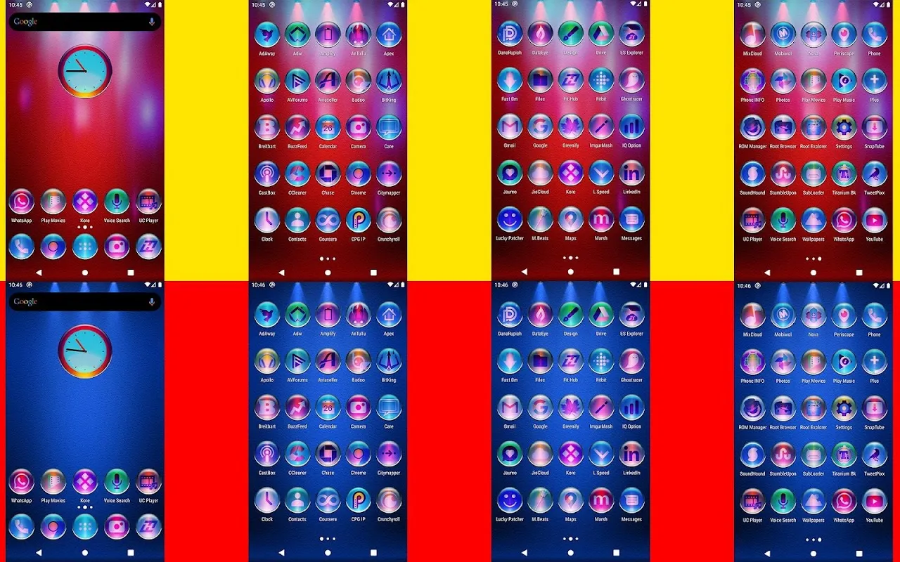
Installing it felt like cracking open a geode. The sheer volume of options – 11,600 they boasted – should've overwhelmed me. Instead, I fell down a rabbit hole of deliberate imperfection. These weren't sterile vector clones; each icon had hand-sanded edges, subtle refractive flaws mimicking real glass, and gradients bleeding like wet watercolor. When applying the pack, I discovered their adaptive masking engine – some hidden sorcery wrapping third-party apps in liquid quartz even when no dedicated icon existed. My banking app transformed from a grim green vault into an emerald jewel case, though the charm faltered when my obscure podcast client emerged as a glowing question mark. That single jarring pixel in a sea of perfection made me snort-laugh at the absurdity of digital vanity.
The true magic struck at dawn. Sunlight hit my bedside table, and my charging phone became a miniature chapel window. Those icons didn't just sit there; they played with physics. Morning rays fractured through the "messages" bubble, casting tiny cerulean diamonds across my pillow. I'd seen icon packs promise "depth," but this? This exploited OLED blackness as negative space, making icons float millimeters above the void. Touching them felt illicit – like smudging actual stained glass in Notre Dame. Yet for all its artistry, the pack had a brutalist edge. Digging into settings revealed why: uncompressed 256x256 PNGs with alpha channels so precise they'd make a Swiss watchmaker weep. This beauty demanded RAM sacrifices, and my aging device occasionally choked when swiping, like a gallery guard trailing behind an overeager tourist.
By week's end, my relationship with this device had fundamentally mutated. Checking notifications became museum curation. That glass-calendar icon? I'd catch myself tracing its lead-came divisions while avoiding actual appointments. The phone stopped being a tool and morphed into a pocket-sized Lalique exhibit – impractical, indulgent, and utterly revitalizing. Yet the pack's greatest trick was psychological: those fragile-looking icons made me handle my phone with monastic care, terrified of shattering the illusion. When my thumb finally slipped and sent a glassy Twitter bird careening into the trash can icon, the visceral wince I felt proved this was more than decoration – it was digital alchemy turning apathy into reverence, one hyper-saturated shard at a time.
Keywords:Colorful Pixl Glass Icon Pack,news,Android customization,icon design,UI personalization


