My Phone's Visual Awakening with Half Light
My Phone's Visual Awakening with Half Light
Rain lashed against my apartment windows as I thumbed through another insomnia-fueled scroll session at 3 AM. The jagged edges of my notification bar caught the blue light - a fractured mosaic of corporate logos screaming for attention. Google's candy-colored triangle, Discord's fractured game controller, Slack's pound sign that felt like a literal weight on my retina. My thumb hovered over the weather widget, but all I registered was the visual cacophony making my temples throb. This wasn't a smart device; it was a digital junkyard where design principles came to die.
![]()
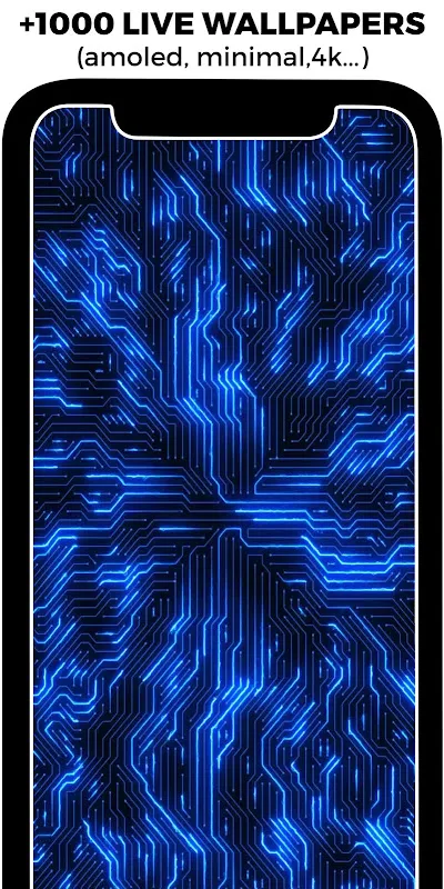
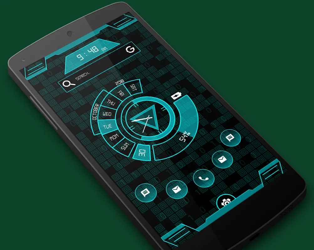
That's when Maria's midnight text arrived with a screenshot - her homescreen glowing with muted gradients and geometric harmony. "Try Half Light," she wrote, "it's like visual Xanax." Skepticism warred with desperation as I navigated to the Play Store. Twenty minutes later, I was elbow-deep in adaptive theming algorithms watching my screen undergo metamorphosis. The magic happened in real-time: as each app icon dissolved, it rebirthed as a minimalist silhouette bathed in twilight hues. WhatsApp's cartoon speech bubble became an elegant crescent moon, Chrome's chaotic primary colors transformed into a single sapphire sphere floating in negative space.
The true revelation came at dawn. With sleep-crusted eyes, I reached for my phone and actually smiled. Where once lived aggressive corporate branding now stood cohesive landscapes - mountain ranges formed from productivity apps, constellations from social media. Half Light didn't just reskin icons; it recontextualized them through parametric design systems. Each 512px vector adapted to my wallpaper's palette, creating depth through calculated transparency layers that made folders appear etched in frosted glass. When I rotated to landscape, the entire grid subtly reflowed like liquid typography.
But perfection cracked on day three. My banking app remained a garish red monstrosity - some proprietary icon that resisted theming. Rage simmered as I dove into Half Light's request portal, discovering their crowd-sourced icon database. The solution? Designing my own replacement using their vector template library. Two hours vanished as I obsessed over bezier curves, translating financial anxiety into a serene jade pagoda icon. The catharsis of replacing corporate aggression with personal symbolism felt revolutionary.
Criticism bites hard though. Their dynamic calendar icon - touted as revolutionary - proved infuriating. Instead of elegant date displays, I got pixelated numerals that resembled 1990s LCD watches when scaled for my tablet. Worse, the auto-update feature once nuked twelve custom icons during a midnight patch. I screamed into a pillow when my meticulously crafted meditation app icon reverted to a stock lotus graphic.
Yet here's the witchcraft: even my fury fuels engagement. Half Light's granular control seduces you into becoming an accidental digital sculptor. Last Tuesday, I spent forty minutes adjusting shadow opacity solely for my podcast app icon, chasing the perfect dawn illusion. The app doesn't just decorate - it rewires your relationship with pixels. Where I once saw utilities, I now perceive kinetic art. My charging phone pulses with subtle auroras along the dock, weather transitions ripple across icons like pond disturbances, and app folders unfold with parallax elegance that makes iOS animations feel clunky.
Three weeks in, the transformation transcends aesthetics. That frantic morning scroll? Now a tactile ritual tracing topographical icon ranges. Notification anxiety lessened as alerts bloomed like bioluminescent algae rather than strobing emergencies. Even my battery improved - turns out obsessive homescreen refreshing drained more power than these lightweight vectors. The true victory emerged during video calls; colleagues kept asking about my "calm-looking background" while their own screens flickered with visual bedlam.
Does it occasionally glitch? Absolutely. Thematic consistency shatters when niche apps lack coverage, requiring manual interventions that test patience. But therein lies the genius flaw - Half Light makes you complicit in the artistry. Every customized icon becomes a tiny rebellion against homogenized digital experiences. At 2 AM last night, I caught myself grinning at my finance folder - that jade pagoda now flanked by a custom crypto tracker shaped like a bamboo ledger. The corporate noise hasn't disappeared... but I've composed my own symphony over it.
Keywords:Half Light Icon Pack,news,Android customization,vector theming,visual wellness