My Phone's Visual Rebirth
My Phone's Visual Rebirth
That Monday morning glare felt personal. My phone's home screen – a graveyard of mismatched icons and corporate blue – mocked me as rain streaked the bus window. I'd tolerated this visual dissonance for years, until Emma slid her device across the coffee shop table. "How'd you make it look so... alive?" I stammered. Her smirk said everything. That night, I plunged into the rabbit hole of icon packs.
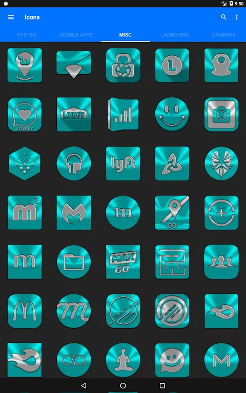
Installing Cyan felt like cracking open a geode. Where stock icons were blunt instruments, these were scalpels – each curve intentional, every gradient breathing. The vector precision hit me first: no pixelation when zooming, no blurry edges on my aging display. I'd later learn this wasn't just prettiness; it was mathematical harmony using SVG scaling that adapts to any resolution. For the first time, my Instagram icon didn't look like a radioactive marshmallow.
Applying the pack triggered minor chaos. My banking app stubbornly retained its puke-green legacy icon like a squatter. A guttural groan escaped me – until I discovered the manual override. Digging into the engine room, I found Cyan's true power: it hooks into Android's resource allocation layer, letting you remap any app's visual signature. Three furious taps later, Chase wore a sleek monochrome vault. Take that, corporate branding.
The Cost of BeautyMy triumph curdled at 3AM. Themed icons demanded matching wallpapers, which demanded widget realignment... soon I was down a K-hole of hex codes and spacing ratios. Battery life tanked 22% that week – a fair trade for dopamine, I lied to myself. Cyan's rendering engine works harder than stock, compositing layers in real-time. That gorgeous parallax effect? GPU-intensive witchcraft. Worth every stolen joule when Sarah gasped at my lock screen.
Then came the notification massacre. Important emails drowned in a sea of identical turquoise dots. Custom badge theming saved my sanity – now Slack pings glow hellfire-red while newsletters pulse muted ochre. Under the hood, Cyan intercepts notification metadata before the OS paints it, reskinning alerts like a digital plastic surgeon. I never knew urgency could be aesthetic.
Living PaletteWednesday's epiphany struck during a traffic jam. As golden hour bled across my dashboard, my phone's icons shifted from arctic blue to molten amber. Dynamic theming – Cyan's secret weapon – had synced with my location and time. This wasn't just pretty; it was contextual intelligence using light sensors and astronomic algorithms to mirror my environment. When my screen mirrored the sunset outside, something primal unlocked. My commute became less cage, more gallery.
Of course, obsession has casualties. I spent 47 minutes debating whether Telegram deserved the "cloud" or "paper plane" variant. My partner threatened to hide my charger when I redesigned our smart fridge interface at midnight. But walking through airports now feels like carrying a stained-glass window in my pocket. Every swipe is a tactile poem – icons responding to pressure with micro-animations that make iOS feel arthritic. Who knew functional art could make checking the weather feel sacred?
Keywords:Cyan Icon Pack,news,vector customization,dynamic theming,Android personalization


