My Phone's Visual Renaissance
My Phone's Visual Renaissance
That Tuesday morning felt like wading through digital quicksand. I'd swipe left past finance apps screaming neon green, then right into productivity tools oozing mismatched gradients - each screen a jarring assault on my retinas. My thumb hovered over a garish yellow weather app when I finally snapped. This wasn't just visual clutter; it was sensory betrayal. My $1,200 flagship device had become a carnival of design atrocities, every icon shouting over its neighbors in chromatic warfare. That moment of visceral disgust became my turning point.
The salvation download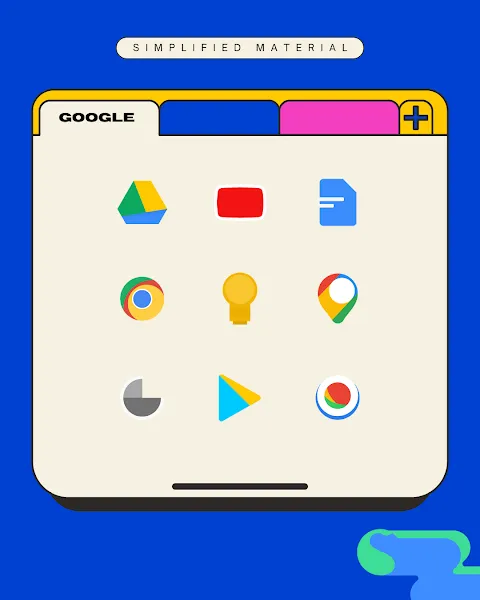
Scrolling through theme forums felt like wandering a digital bazaar until I stumbled upon it - a minimalist thumbnail radiating calm amidst visual chaos. Installation took three taps, but the transformation felt like peeling grime off a cathedral window. Suddenly my banking app shed its radioactive glow for elegant monochrome lines. My calendar morphed from cluttered boxes into clean geometric poetry. What struck me wasn't just aesthetic improvement - it was the vector precision in every curve, how shadows fell identically across 300+ icons as if carved from the same digital marble. For the first time, swiping between screens felt like turning pages in a beautifully typeset book rather than flipping through a toddler's sticker album.
The hidden engineeringWhat appears as simple beauty reveals astonishing technical craftsmanship. Unlike slapped-on PNG files, these icons leverage Android's adaptive framework through layered vector assets that dynamically reshape based on device and context. That cloud storage icon isn't a static image - it's mathematical equations rendering flawlessly whether displayed at 48dp on my home screen or 24dp in my dock. The pack's true genius emerges in its systematic color algebra: saturation values calibrated within 5% variance across categories, luminosity balanced to prevent retinal fatigue during night scrolling. I discovered this when obsessively theming my grandmother's ancient tablet - watching those vectors rescale perfectly onto her low-res display proved these weren't just pretty pictures but precision-engineered visual code.
When perfection stumblesMy euphoria hit its first snag at 2AM during a panic search for my VPN app. Buried among newly elegant icons, one rogue soldier stood defiant - some obscure utility the pack hadn't conquered. That single neon offender glared like a zit on a supermodel's nose. The betrayal felt personal. Yet this flaw revealed the pack's cleverest feature: the manual override tool. Digging into its settings felt like accessing developer mode - I could extract the dominant hue from adjacent icons, sample the exact line weight, then craft custom icons that disappeared seamlessly into the visual chorus. Three hours later (yes, I became that obsessive), my digital universe achieved complete harmony. That victory tasted sweeter than any default perfection.
Weeks later, the magic persists in subtle ways. Unlocking my phone now delivers a micro-dose of serenity before the daily storm. My eyes no longer flinch anticipating visual cacophony - instead they glide across serene landscapes of intentional design. There's profound psychology in this visual order; the consistent shapes and restrained palette create cognitive ease that actually reduces my scroll-induced anxiety. I've caught myself lingering on app folders just to admire how tertiary colors transition like a Monet gradient. This isn't mere decoration - it's visual therapy for the attention economy's casualties. My phone finally feels like home rather than a hostile interface demanding constant navigation. And isn't that what technology should ultimately deliver - not more complexity, but pockets of ordered calm in our chaotic digital lives?
Keywords:Simplified Material Icon Pack,news,material design,icon customization,android theming


