My Pixel's Visual Detox Journey
My Pixel's Visual Detox Journey
That Tuesday morning felt like wading through digital sludge. My thumb hovered over Instagram's neon explosion, then recoiled to Slack's screaming red badge - each icon a visual shriek demanding attention. My phone had become a carnival of distraction, every swipe triggering sensory whiplash. I'd catch myself reflexively refreshing apps just to escape the chromatic assault, my productivity dissolving in that electric rainbow haze.
Discovering the monochrome sanctuary felt accidental yet inevitable. While researching minimalist UI patterns for work, I stumbled upon Ronald Dwk's creation buried in design forums. Skepticism bit hard - could black and white pixels truly declutter my digital existence? But desperation overruled doubt. The installation ritual became unexpectedly cathartic: watching each garish icon dissolve into elegant silhouettes felt like shedding layers of noise-polluted armor.
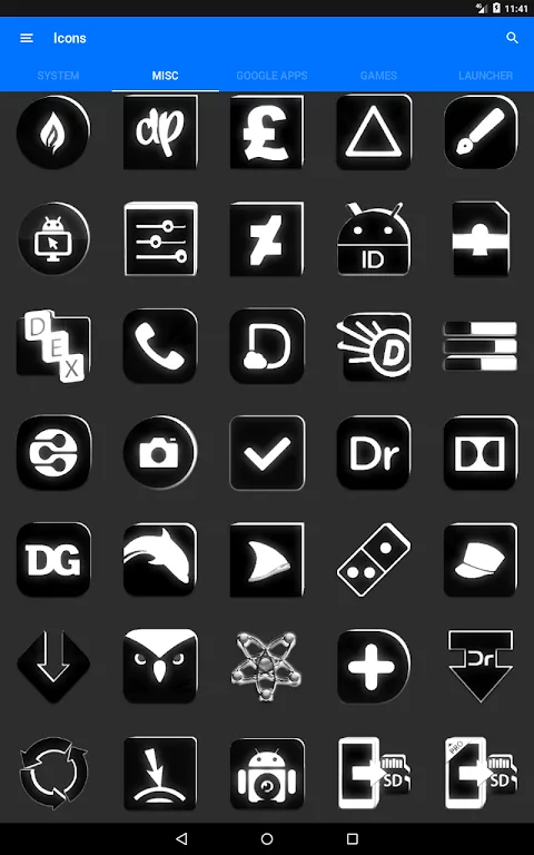
Waking to transformed screens delivered visceral shock. Where candy-colored chaos once reigned, now stretched a zen garden of negative space. The vector-perfect linework revealed astonishing detail invisible before - the subtle curve differentiating Messages from Mail, the clever negative space hinting at Camera's aperture. My morning scroll became meditation rather than reflex, fingers gliding across what felt like etched limestone rather than cheap plastic.
The true revelation struck during my commute. As subway lights flickered, every other screen blazed like miniature casinos while mine remained serene. The dynamic calendar icons proved ingeniously practical - date numerals updating silently without widget clutter. I chuckled noticing how the minimalist clock face made me check less frequently, its uncluttered elegance subtly breaking my time-anxiety habit.
Yet perfection remained elusive. Some third-party banking apps stubbornly resisted the transformation, their garish logos sticking out like neon graffiti on parchment. More frustrating was discovering edge cases where ultra-similar monochrome icons caused mis-taps - nearly archived a client proposal when aiming for Notes. The pack's creator deserves praise for the adaptive masking technology that reshapes irregular icons into cohesive circles, but occasional visual ambiguity remains its Achilles' heel.
Three weeks in, the psychological shift still startles me. My phone no longer screams for attention but waits patiently. Battery life improved noticeably without GPU-straining gradients. Most profoundly, the monochrome discipline spilled offline - I've cleared physical desktops, simplified workflows, even switched my wardrobe palette. This visual asceticism became unexpected mindfulness training, each interaction now intentional rather than compulsive. My screen finally breathes.
Keywords:Flat Black and White Icon Pack,news,digital minimalism,UI design,productivity enhancement


