My Screen's Soul Revival
My Screen's Soul Revival
I remember that Tuesday afternoon with brutal clarity – dropping my phone face-down on the pavement, watching the screen splinter like frozen lake ice. As I picked it up, those jagged lines seemed to mirror how I'd felt about this device for months: functional but fractured, utterly devoid of personality. Repairing the glass only amplified the emptiness; staring at rows of identical corporate-blue icons felt like eating plain oatmeal every single morning. That mechanical swipe-to-unlock ritual had become a tiny death of joy, until desperation drove me into the app store's neon jungle at 2 AM.
The Download That Changed Everything
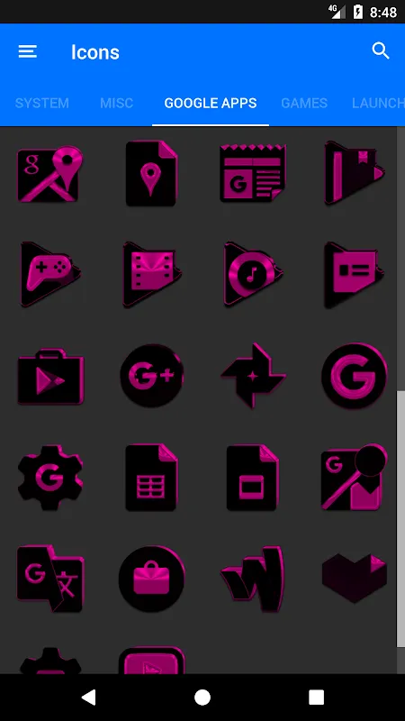
Scrolling past endless "minimalist" packs promising "elegance" but delivering sterility, one thumbnail exploded into my bleary vision – a volcanic collision of matte black and electric pink. No gentle gradients here; this was a visual scream demanding attention. Installing it felt reckless, like ordering mystery seafood from a back-alley vendor. But when the app opened? Holy hell. Suddenly I wasn't just changing pixels; I was cracking open my phone's ribcage to rewrite its heartbeat. The vector-based rendering engine meant every curve on the music note icon looked liquid-smooth even when zoomed 400%, no jagged edges haunting my periphery like cheap clipart ghosts.
Applying Icons Became Archaeology
Manually replacing each icon became an obsessive midnight ritual. I'd press down on LinkedIn's bland briefcase symbol, watching it shatter like the screen had weeks prior, then slot in its replacement – a jagged, onyx shard wrapped in neon-pink vines. The calendar app transformation blew my mind: that dynamic date scripting didn't just display numbers; it painted the "24" in dripping pink paint texture on New Year's Eve, then switched to frost-encrusted digits during December snowstorms. Yet frustration bit hard when discovering bank apps couldn't be themed – their garish yellow logos stuck out like rotten teeth in a movie star's smile. I rage-typed a support ticket at 3 AM: "Your refusal to let me bury these abominations is CRIMINAL."
When Pixels Alter Reality
Weeks later, the magic hit unexpectedly. Grocery shopping, exhausted, I fumbled for my shopping list app. My thumb found not some soulless clipboard icon, but a sketched notepad bleeding pink ink at the corners – and inexplicably, I grinned like an idiot in the cereal aisle. That's when I realized this wasn't decoration; it was neurological warfare. The high-contrast color psychology embedded in those 5500+ icons hijacked my dopamine pathways; tapping the blood-red camera with black lace overlay felt dangerously luxurious, transforming mundane photo snaps into imagined noir film shoots. My phone stopped being a tool and became a mood ring forged in digital fire.
Keywords:Black and Pink Icon Pack,news,vector rendering,dynamic calendars,color psychology


