Rainy Day Design Crisis: How My Phone Became My Studio
Rainy Day Design Crisis: How My Phone Became My Studio
Rain lashed against the cafe window like a frantic drummer as I stared at my steaming americano. My laptop sat uselessly at home, but the Slack notification screamed urgency: "Client DEMO MOVED TO 3 PM – FINALIZE PROTOTYPE NOW." Panic clawed my throat. Forty-five minutes until showtime, and I was stranded with only my phone. That’s when I fumbled for Figma’s mobile companion, my fingers trembling against the cold glass. Loading the file felt like defusing a bomb – one wrong tap could ruin weeks of work. The homepage appeared, minimalist and calm, mocking my adrenaline spike. I zoomed into the checkout flow, spotting the misaligned button instantly. A clumsy swipe later, I nudged it pixel-perfect. Relief washed over me like the downpour outside. This wasn’t just editing; it was digital triage.
But let’s be brutally honest – mobile design ain’t ballet. Trying to adjust a complex component set felt like performing brain surgery with oven mitts. My thumb slipped, dragging layers into chaos. I cursed under my breath as a drop-down menu exploded across the artboard like shrapnel. Figma’s vector networks saved me – their mathematical precision recalculated anchor points instantly, untangling my mess before the client could blink. Yet the rage simmered: why did pinch-to-zoom stutter like a dying engine during playback? Later, I’d learn it throttles GPU rendering to prevent mobile meltdowns – a necessary evil that still made me want to spike my phone into the espresso machine.
The Magic and Madness of Live CollaborationSuddenly, purple cursors materialized on screen – my developer Marco dropping feedback from his train commute. Watching his annotations bloom in real-time felt like telepathy. He circled a broken link while texting me: "FIX THIS DEAD ZONE." I tapped the hotspot, my phone vibrating as the prototype responded. Operational transformation algorithms worked overtime beneath the surface, merging our edits without merge conflicts. But when Marco uploaded a 4K background image? The app choked. Frame rates plummeted to slideshow territory as thermal warnings flashed. I screamed into my cappuccino foam – no one tells you about mobile’s brutal asset limits. That glorious sunset photo became a pixelated nightmare, forcing us to downgrade to JPEG while the clock screamed.
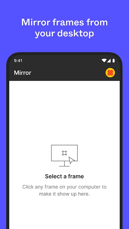
Later, testing micro-interactions on my cracked screen revealed ugly truths. Haptic feedback misfired during swipe gestures, making navigation feel like a glitchy ghost touch. I raged at the inconsistency until discovering Figma’s accessibility overrides – reducing animation complexity restored buttery smoothness. Victory tasted like cold coffee. Yet the triumph faded when presenting: device mirroring lagged two seconds behind my taps during the demo. The client’s eyebrow raise said it all. Afterwards, I learned to pre-cache prototypes – a workaround that shouldn’t be necessary.
Now? I still carry that caffeine-shaky memory. Figma Mobile didn’t just save my deadline; it exposed design’s dirty secrets. Mobile constraints force brutal prioritization – if it survives thumb-jabbing chaos, it’ll thrive anywhere. But damn, I’ll never forgive how it murdered Marco’s sunset.
Keywords:Figma Mobile,news,real-time collaboration,mobile prototyping,design constraints


