Rainy Day Revival: When Words Met My Photo
Rainy Day Revival: When Words Met My Photo
That Thursday morning felt like the universe had spilled its gray paint bucket over Chicago. Rain lashed against my office window as I scrolled through my camera roll, stopping at the photo from last weekend’s disaster—my niece’s soccer game. There it was: little Emma mid-kick, mud splattering her knees, rain plastering her hair flat, and the ball a blurry smudge against gloomy skies. The raw energy was palpable, yet it screamed unfinished business. Just another chaotic snapshot lost in digital oblivion. My thumb hovered over the delete button. What good was a memory that looked like a sad dishrag?
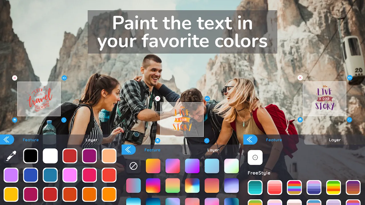
Then I remembered the text editor my designer friend swore by—some free thing she’d mentioned between sips of overpriced coffee. Downloaded it skeptically, half-expecting another clunky tool demanding subscription blood. The icon blinked open, and suddenly I wasn’t staring at a muddy mess anymore. The interface slid into view like a velvet curtain revealing a stage. Clean, stupidly simple. No intimidating panels or jargon. Just my photo center-stage, waiting. Felt like unlocking a diary I never knew I had.
First touch—the text tool. I tapped where Emma’s determined scowl met the rain. A cursor blinked. Hesitated. What could words add to this soggy chaos? Typed "MUD > FEAR" in a hesitant lowercase. Instantly, the letters morphed into this bold, dripping font called "Storm Sans." Watched in real-time as the app’s rendering engine—probably some vector magic—antialiased the edges smoother than whiskey silk. No pixelated garbage. Just crisp defiance hovering over her drenched jersey. Then came the real sorcery: layer blending. Slid the opacity down until the text looked rain-smeared itself, like graffiti battling the downpour. Felt my spine tingle. This wasn’t editing; it was time travel.
Next, filters. Scrolled through presets labeled "Melancholy Monsoon" and "Grunge Revival." Chose one called "Vintage Vengeance"—deepened the greens, crushed the blacks, added grain that made the raindrops look like shattered glass. But here’s where the technical ballet floored me: real-time previews without lag. On my three-year-old phone! Most apps choke when stacking effects, but this thing processed adjustments locally using GPU acceleration. Felt like whispering to a genie. One flick, and the bleak gray sky gained bronze undertones, making Emma’s neon cleats pop like rebellion. My critic brain snarled, "Overdone?" Undid it. The app didn’t stutter. Just reset faster than my doubt.
Ah, but the ads. Free version’s curse. Mid-inspiration, a pop-up for premium filters erupted—"UNLOCK CINEMATIC MASTERPIECES!"—obscuring Emma’s face. Rage-flinched. Punched the tiny 'x' so hard my nail cracked. For a glorious 10 minutes, though? Pure flow. Added a second line: "HER PUDDLE, HER KINGDOM" in a handwritten script that bled at the edges. Positioned it diagonally, mirroring her kick’s trajectory. The app’s alignment grid snapped subtly, keeping it balanced without rigidity. No PhD required. Just intuition and fingertips colluding.
When I finally saved it, something cracked open in my chest. Shared it to our family chat. Silence. Then my sister called, voice thick: "You made her look like a warrior poet." Emma demanded it as her iPad wallpaper. That photo—once destined for deletion—now hangs framed in their hallway. All because a stupid-free app treated pixels with reverence. Still hate the ads, though. And that one "Neon Dream" filter? Turned the grass radioactive snot-green. Avoid like expired milk.
Keywords:Text Art,news,photo storytelling,real-time editing,free design tools
