Text Art Spoke Where I Couldn't
Text Art Spoke Where I Couldn't
Rain lashed against my apartment windows last Thursday, the kind of gloomy afternoon that makes old grief feel fresh. I’d scrolled past the folder labeled "Buddy" a dozen times that week, my thumb hovering like a coward over the screen. When I finally tapped it, there he was—my golden retriever mid-zoomies in the park, grass stains on his paws, tongue lolling in that derpy grin I’d give anything to ruffle again. The photo screamed joy, but all I heard was silence. How do you caption a memory that claws at your throat? Desktop editors felt like performing surgery with a chainsaw: layers, masks, and that cursed "font kerning" option mocking me. Then I remembered that stupid ad I’d dismissed—something about text on photos. With a sigh that fogged the screen, I downloaded Text Art.
The Unlearning
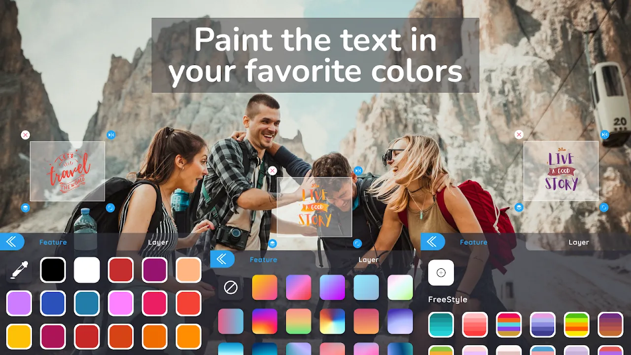
Within seconds, Text Art’s interface felt like sliding into a warm bath. No "Welcome to Adobe Hell" tutorials. Just my photo of Buddy, clean and centered, with a toolbar floating beneath like a polite butler. I jabbed at the "T" icon, half-expecting Comic Sans to assault my eyes. Instead, a sleek panel slid up—fonts organized not by alphabet but mood. "Whimsical." "Elegant." "Raw." Raw. My finger shook as I selected it. The real-time rendering engine kicked in before I even typed a letter, previewing how the jagged, ink-bleed font would slice through the image. No lag, no spinning wheel—just Buddy’s fur sharpening beneath the ghost text as I dragged my finger. When I typed "Remember the squirrels?", the letters materialized like scars on the photo, weighty and imperfect. Perfect.
Filtered Truths
But the words looked too clean against Buddy’s muddy paws. I needed grit. Scrolling the filter carousel, I ignored the candy-colored presets ("Sunset Glow," ugh) and dove into "Grunge." Filters here weren’t just slaps of color—they had hierarchy. "Concrete Dust" layered a fine grain over Buddy’s coat, while "Vintage Tear" added subtle texture to the text itself, mimicking weathered paper. I learned later this wasn’t random: the app uses mask-based blending algorithms, treating text and image as separate entities that "bleed" into each other based on opacity sliders. When I chose "Rust," the text oxidized at the edges, as if Buddy’s memory was literally weathering in my hands. Devastating. Brilliant.
When Tech Stumbles
Not all magic worked. At one point, I tried stacking two filters—"Noir" and "Fog"—to mimic that rainy-day gloom. The app choked. Colors pixelated into a muddy soup, and the text vanished like a ghost. I nearly hurled my phone. Turns out, GPU overload protection kicks in aggressively; it prioritizes speed over complexity, forcing you to commit to one effect at a time. Annoying? Absolutely. But also… honest. Like the app saying, "Grief isn’t multitasking, dummy." So I scrapped "Fog," kept "Noir," and watched Buddy’s joyful blur sharpen into monochrome clarity. The contrast gutted me: pure light in a dark world.
The Share That Broke Me
When I finally saved it, the image didn’t just hold words—it held weather. The "Rust" filter had deepened the gold in Buddy’s fur, the "Raw" font slanting like handwriting on a condolence card. I posted it. No hashtags, no context. An hour later, my inbox flooded. Friends who’d known Buddy sent voice notes sobbing. One stranger DM’d: "Lost my lab last month. This is exactly how it feels." That’s when I realized Text Art’s dirty secret: it weaponizes simplicity. By stripping away every technical barrier, it forces emotion to the surface. No fancy software required—just a cracked heart and a thumb. Now excuse me while I cry into my coffee again.
Keywords:Text Art,news,photo memories,text overlays,emotional design


