Walloop: A Personal Screen Revival
Walloop: A Personal Screen Revival
I remember the day my phone screen felt like a prison. It was a Tuesday, I think, the kind of day where the gray sky outside my window perfectly matched the dull, static image of a generic mountain range I’d had as my background for what felt like an eternity. My thumb would swipe to unlock, and there it was—a flat, lifeless reminder of my own digital monotony. I wasn’t just bored; I felt a low-grade, persistent annoyance every time I glanced at my device. It was supposed to be a portal to the world, but it had become a slab of colored glass reflecting my own lack of inspiration.
The change started with a moment of sheer frustration. I was scrolling through a social media feed, my eyes glazing over, when a friend posted a video of their phone screen. It wasn’t the content that caught my eye; it was the background. Behind their icons, a serene, hyper-realistic forest scene subtly shifted. Leaves rustled in a non-existent breeze, and light dappled through animated branches. It wasn’t obnoxious or gaudy; it was… alive. A tiny spark of envy ignited in my chest. I needed that. I needed my screen to feel like more than just a tool.
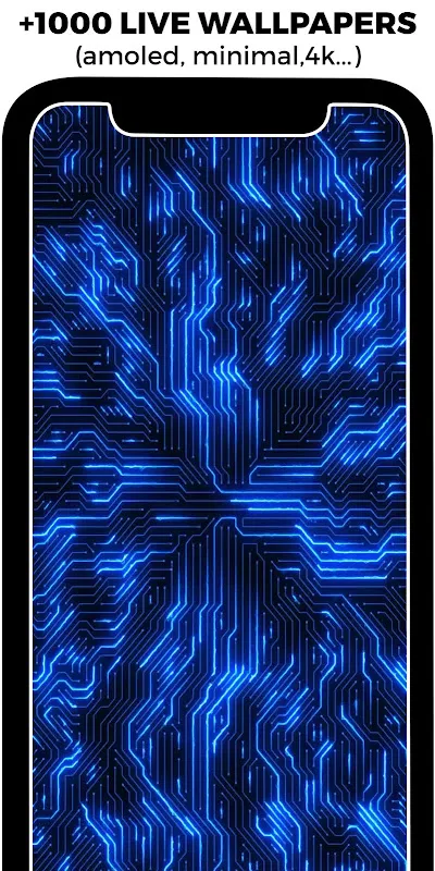
That’s when I found it. I didn’t search for “live wallpapers”; I think I typed something desperate like “how to make my phone not suck.” Among the results, the name Walloop stood out. It sounded playful, almost whimsical. Downloading it felt like a small act of rebellion against my own digital apathy. The installation was swift, a promise of things to come. Upon opening the app, I was immediately struck not by a chaotic mess of options, but by a clean, intuitively organized library. It was here that the first technical marvel quietly announced itself: the categorization. It wasn't just “HD” or “4K”; it was sorted by mood, by theme, by motion type. This implied a backend understanding of metadata tagging and user experience design that went beyond simple file hosting. They had thought about how a person *feels* when they browse, not just what they see.
My finger hovered over the categories. “Abstract,” “Nature,” “Space.” I chose “Cosmic.” The grid of thumbnails loaded instantly, each one a tiny, moving portal. But the real magic happened when I tapped one to preview it. The wallpaper didn’t just play in a small window; it took over my entire screen in a seamless, full-screen preview. This is where I got my first taste of the battery optimization they tout. The preview wasn’t running at full, uncompressed resolution; it felt like a smart, adaptive stream that gave me the full visual impact without the immediate power drain. It was a clever bit of engineering, previewing the experience without committing the hardware resources. I spent a good twenty minutes just swiping through galaxies and nebulas, watching stars pulse and dust clouds swirl. It was hypnotic.
I finally settled on one: a deep field view of the Orion Nebula. The colors were breathtaking—vivid purples, deep reds, and brilliant blues. Setting it was a simple tap. The moment I pressed “Set as Wallpaper” and returned to my home screen, my breath caught. My phone was transformed. Icons for emails and calendars now floated over a canvas of cosmic creation. The nebula’s gases shifted slowly, almost imperceptibly, giving the screen a sense of immense depth and quiet dynamism. It was no longer a screen; it was a window. This was the core visual alchemy of the application—it leveraged the device's GPU to render these complex, often 3D or simulated 4D environments in real-time, but did so with an efficiency that felt like dark magic. The parallax effect as I swiped between home screens made the nebula appear three-dimensional, a trick achieved through layered image rendering and motion sensors.
For the next week, my relationship with my phone changed. Picking it up in the morning wasn't a chore; it was a moment of minor awe. The slow, graceful dance of celestial light was a calming contrast to the frantic pace of notifications. I found myself unlocking my phone just to stare at the background for a few seconds, a small digital meditation. The app had successfully injected a dose of passive beauty into my daily routine. It wasn’t an app I used actively; it was an app that worked its magic in the background, enhancing every other interaction I had with the device.
But it wasn’t all stellar nebulae and smooth performance. The first crack in the perfect facade appeared when I decided to get greedy. I found a stunning 4D wallpaper of a cascading waterfall, with water that seemed to flow over the edges of the screen. It was magnificent in the preview. However, once set, I noticed a slight but persistent stutter in the animation, a hiccup in the water’s flow every few seconds. It was jarring. The seamless illusion was broken. This, I suspect, was the downside of pushing the hardware boundaries. My phone, while not ancient, wasn't the latest flagship model. The app’s attempt to render such a complex, multi-layered fluid simulation was likely maxing out my GPU. The battery optimization, so elegant on simpler wallpapers, seemed to struggle here. Over the course of a day, I watched my battery percentage drop faster than usual, a tangible cost for this visual extravagance. It was a brutal reminder that even the most beautiful software is shackled by the limits of the hardware it runs on. I felt a pang of disappointment, a mix of “why can’t my phone handle this?” and frustration at the app for not having a more aggressive, adaptive quality scaler for older devices.
This experience led me down a rabbit hole of experimentation. I became obsessed with finding the perfect balance between visual splendor and performance. I’d set a new wallpaper, use my phone normally for a few hours, and then obsessively check the battery usage stats. I learned, through trial and error, that the abstract and particle-based wallpapers were incredibly efficient. A simple animation of flowing colorful smoke used negligible power while still providing a dynamic feel. The 3D geometric patterns were also light on resources. But the moment I ventured into high-resolution video wallpapers or complex simulations, the trade-off became apparent. This hands-on testing felt like I was reverse-engineering the app’s inner workings. I wasn’t just a user; I was a tinkerer, learning the language of my device’s capabilities through the lens of this single application.
The emotional rollercoaster was real. The joy of discovering a wallpaper that was both beautiful and battery-friendly was immense. It felt like a personal victory. The irritation when a favorite wallpaper caused noticeable lag was equally potent. I remember one evening, showing off my new “living screen” to a friend, only to have the animation stutter at the exact wrong moment, undermining the whole effect. I felt a flash of embarrassment, as if I’d been caught exaggerating. It was a silly feeling, but it was genuine. This app had somehow managed to tie my emotional state to the performance of my phone’s background image.
Weeks turned into a month, and the novelty didn’t wear off; it evolved. I’d change the wallpaper to match my mood—a calm, flowing liquid metal for focused workdays, a vibrant, abstract explosion of color for weekends. The app became a tool for digital self-expression, a way to curate the first thing I saw every time I used my phone. The initial frustration with my dull screen had been completely replaced by an engaged, almost playful relationship with my device. Walloop hadn’t just given me animated pictures; it had given me a reason to care about the canvas itself.
Yet, the memory of that stuttering waterfall still lingers. It’s the app’s one great flaw in my eyes—a lack of intelligent, user-transparent performance scaling. I wish it had a “performance mode” that could automatically downgrade the rendering quality on the fly to maintain smoothness, rather than forcing me to choose between beauty and utility. It’s a sophisticated piece of software that occasionally forgets not everyone is running it on cutting-edge silicon.
In the end, my screen did come alive. It breathes and shifts with a life of its own now, a constant, gentle reminder that there can be artistry even in the utilitarian. The journey with Walloop was one of discovery, frustration, and ultimately, a small but significant re-enchantment with the device I hold in my hand every day. It taught me that technology’s highest purpose isn’t always raw functionality; sometimes, it’s the quiet, background magic that makes the functional feel fantastic.
Keywords:Walloop - Live Wallpapers,news,mobile customization,visual aesthetics,battery optimization


