When Calls Bloom With Color
When Calls Bloom With Color
It was Tuesday afternoon, and my phone buzzed with yet another unknown number—probably another robocall. I sighed, reaching for the device with the same dread I reserved for dental appointments. That's when it happened: instead of the generic gray interface I'd come to loathe, my screen erupted into a swirling galaxy of deep blues and purples, with tiny stars that seemed to dance toward my fingertips. For a moment, I forgot this was probably someone trying to sell me an extended car warranty.
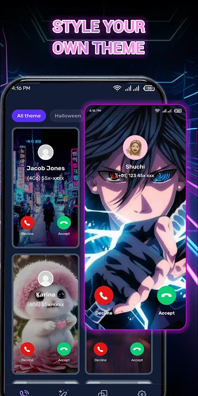
I'd downloaded Color Call Theme on a whim during a particularly boring commute, expecting another gimmicky app that would clutter my phone for a week before getting deleted. What I got instead was something that felt like discovering technicolor after a lifetime of black-and-white television. The first thing that struck me wasn't the visual spectacle—though that was impressive—but how the app seemed to understand something fundamental about human connection that tech companies had forgotten: that the space between rings matters.
The Magic Behind the Curtain
What makes this sorcery possible is actually rooted in some fascinating technical wizardry. The app doesn't just overlay pretty pictures—it uses real-time rendering engines typically reserved for mobile games to create dynamic, responsive backgrounds that react to your touch. When my friend Sarah calls (assigned a sunset beach scene because she's my calm amidst chaos), the waves actually respond to how I swipe to answer. If I'm impatient, they crash violently; if I take my time, they lap gently. This isn't just cosmetic—it's using physics engines and touch-interpolation algorithms that made me wonder why other developers haven't thought this way.
The personalization goes deeper than I expected. You're not just picking from preset themes—you're creating emotional landscapes. When I assigned my mother's calls a garden theme, I could actually watch digital flowers bloom during the ringing sequence, each petal unfolding in real-time based on some complex algorithm that mimics natural growth patterns. The first time she called after I set this up, I found myself smiling before even hearing her voice—something that never happened with the sterile default screen.
The Glitches That Remind You It's Human-Made
It's not perfect, and thank God for that. The imperfections make it feel human. Sometimes when my boyfriend calls (his theme is a cozy fireplace because he's my comfort), the flames render a bit too enthusiastically and make my phone warm to the touch. I've come to love this quirk—it feels like technology with personality rather than cold efficiency. Another time, after a software update, all my assigned themes got scrambled for a day. My stern boss suddenly had a bubblegum pink unicorn theme, and I have to admit—receiving his call surrounded by dancing cartoon unicorns made that particular conversation about quarterly reports significantly more bearable.
What fascinates me technically is how the app manages to do all this without murdering my battery. It uses adaptive rendering that scales complexity based on your device's current capacity and thermal state. On days when I'm running low on power, the animations become simpler but no less beautiful—like an artist switching from oil paints to watercolors when supplies run low.
The Unexpected Emotional Impact
Here's the thing nobody tells you about personalizing your digital interactions: it changes your relationship with technology in subtle but profound ways. I found myself actually looking forward to calls instead of treating them as interruptions. When my best friend called during a stressful day, her theme (a swirling galaxy because she helps me see the bigger picture) made me pause and actually breathe before answering. The three seconds of ringing became a moment of mindfulness rather than annoyance.
There's something deeply human about assigning visual emotions to the people in your life. My grandmother gets a vintage book theme because talking to her feels like turning well-worn pages. My yoga instructor gets floating lotus flowers. The delivery guy gets a simple but cheerful cartoon pizza because, well, priorities. Each theme has become a tiny story, a visual handshake before the conversation even begins.
The real test came during a period of anxiety I went through last month. Every phone call felt like a potential crisis, and I'd developed actual physical tension when my phone rang. Customizing my call screens became a form of therapy. I created calm, expansive themes for everyone—open skies, quiet forests, gentle oceans. Over time, those few seconds of beautiful imagery before answering created a buffer between my anxiety and the conversation. It didn't cure my anxiety, but it gave me a moment of beauty to grasp onto before facing whatever was on the other end of the line.
I've come to see Color Call Theme as more than an app—it's a small rebellion against the monotonous digital experiences we've been conditioned to accept. In a world where technology often feels increasingly impersonal, this little application reminds me that human connection—even through screens—can still be beautiful, intentional, and sometimes even magical. The next time your phone rings, maybe it won't just be a interruption—maybe it'll be a moment of unexpected beauty.
Keywords:Color Call Theme,news,personalization technology,emotional design,mobile communication


