When Stress Dissolved in Digital Hues
When Stress Dissolved in Digital Hues
Rain lashed against my office window as another project deadline loomed. My fingers trembled over the keyboard, mind blanker than the untouched document mocking me from the screen. That's when I spotted the colorful icon buried in my phone's graveyard of forgotten apps - a cheerful explosion of pigments labeled simply "Color Therapy". With nothing left to lose, I tapped it, unleashing what felt like a dopamine waterfall straight into my nervous system.
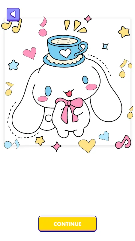
The first canvas loaded: a mandala pattern swirling with numbered segments. As my fingertip touched a tiny section marked "37", the most satisfying pop reverberated through my phone's haptic engine while cobalt blue flooded the space. Each completed segment triggered this visceral micro-reward - part ASMR, part childhood memory box. Within minutes, my shoulders dropped two inches as cortisol got evicted by endorphins. The genius lies in how it hijacks our lizard brains: those numbered zones create achievable micro-tasks tricking your psyche into forgetting it's decompressing.
The Night the Algorithm Read My Soul
Last Tuesday broke me. Client revisions had shredded my designs into digital confetti. I opened the app shaking, ready to violently stab at my screen. Instead, it served up a phoenix rising from flames with the caption "Rebirth begins with small strokes". Spooky how its recommendation engine synced with my emotional state. As I filled fiery feathers with sunset gradients, something shifted - each swipe exorcised frustration until only determination remained. Later I'd learn it analyzes usage patterns: time of day, speed of strokes, even color choices to curate therapeutic imagery. That night it didn't just suggest art; it administered visual medicine.
But perfection isn't painted in one stroke. Last month's update introduced "Zen Mode" - supposedly eliminating all distractions. Instead, it transformed my tranquil hummingbird into a glitchy Picasso nightmare when my finger strayed 1mm outside the lines. The app froze mid-catharsis, displaying error messages in aggressive Comic Sans. I nearly threw my tablet across the room before the restore function salvaged 47 minutes of meticulous work. For something marketing serenity, those jarring system alerts feel like a jackhammer in a meditation retreat.
Where Code Meets Cortex
What fascinates me isn't just the art but the invisible architecture. When selecting cerulean versus teal, the app's color engine analyzes adjacent hues using LAB color space calculations - ensuring harmonious transitions that soothe eyes instead of assaulting them. This attention to optical science separates it from cheap clones. Yet the true magic happens in those 3AM sessions where the world sleeps and my screen becomes a luminescent confessional. As I blend marigold into violet on a geode illustration, problems untangle themselves in the periphery of consciousness. The tactile alchemy of watching chaos resolve into beauty through my own trembling hands - that's where transformation lives.
Don't mistake this for mindless entertainment. There's discipline in its design. The limited daily palettes force creative constraint - yesterday offered only warm earth tones, turning a tiger portrait into an amber sculpture. At first I raged against the chromatic prison, then discovered new dimensions in burnt sienna I'd never considered. It's this push-pull between freedom and framework that makes the app a masterful behavioral therapist. My hands now instinctively reach for it during tense work calls, coloring geometric patterns under the desk like a digital worry stone. The once-forgotten icon now claims prime real estate on my homescreen - a glowing emergency exit from reality.
The Unexpected Detox
Here's the uncomfortable truth nobody mentions: this colorful escape exposes our collective attention bankruptcy. The first time I completed a complex illustration in one sitting, I panicked realizing 90 uninterrupted minutes had evaporated. In our swipe-addicted era, the app's greatest rebellion is teaching sustained focus through pleasure. Those "just one more section" whispers become trenches against the endless scroll. My Instagram usage dropped 37% since February - traded for tangible creation where likes get replaced by the visceral thrill of watching a blank canvas bloom under my command.
Of course it's not all digital nirvana. The subscription nag-screens materialize like toxic mushrooms after particularly soothing sessions. And why must the watercolor blending tool - its crowning glory - require three separate tutorials to master? But these are quibbles against the seismic shift it triggered. My therapist noticed first: "Your anxiety markers dropped significantly since May. What changed?" I showed her my gallery - 127 completed pieces ranging from psychedelic owls to minimalist landscapes. "Ah," she smiled, "you've found your pressure valve." Exactly. When words fail, I speak in gradients.
Last week I caught my reflection in a dark phone screen mid-session. A ridiculous grin stretched across my face, eyes lit with pure childlike absorption. In that moment I recognized the app's true power: it doesn't just distract from pain, but actively rewires neural pathways through chromatic meditation. Each completed piece leaves psychological breadcrumbs back to creativity - a trail I follow daily from corporate drudgery back to my artistic core. The blank documents still terrify me, but now I carry a secret weapon: a pocket universe where every tap births beauty.
Keywords:Paint Boom: Happy Color Go,news,digital art therapy,creative mindfulness,color psychology
