Breaking Free from Default Fonts
Breaking Free from Default Fonts
Midnight oil burned as I glared at my laptop screen, fingers frozen above the keyboard. My freelance client's branding project lay before me - a soulless mosaic of Arial and Times New Roman. That familiar dread pooled in my stomach; another generic design about to ship because typeface indecision paralyzed me. How did professional designers navigate this ocean of choices without drowning?
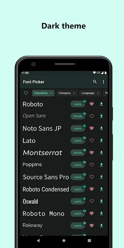
Then it happened. While rage-scrolling through design forums, I stumbled upon a shimmer of hope: an app promising instant access to Google's entire font library. Skepticism warred with desperation as I tapped download. What greeted me wasn't just another font catalog - it was a visual playground where tapping any font instantly transformed my placeholder text. Suddenly "Brand Identity" shifted from sterile Helvetica to playful Quicksand, then morphed into authoritative Playfair Display. The tactile thrill of seeing concepts evolve in real-time made my spine tingle.
But the real magic struck during client chaos. They demanded last-minute changes while I was stranded at the airport, laptop buried in checked luggage. Panic surged until I remembered the app on my phone. Crouched near a charging station, I scrolled through categorized fonts while narrating options over speakerphone. When I demonstrated variable weight adjustment by sliding my thumb, the client gasped: "That's EXACTLY the boldness we need!" The gate agent probably wondered why some madman was crying over typography at Gate B7.
Of course, paradise has thorns. That glorious 1800+ font library? It becomes a horror show when hunting for one specific style at 2 AM. Endless scrolling induced vertigo, and the lack of advanced filtering made me want to hurl my phone when searching for slab serifs with low x-height. Worse, the app occasionally choked when rendering complex scripts, turning beautiful Devanagari into pixelated hieroglyphics. Yet these frustrations felt like growing pains - the anger of a kid learning bicycle balance before the glorious freedom of riding.
Now my design ritual transformed. Coffee steam rises as I wander through font neighborhoods each morning - playful display types for mood boards, serious sans for corporate work. Discovering how ligature combinations in Crimson Text made legal documents feel like handwritten letters? That's the dopamine hit designers rarely admit we crave. My client presentations now begin with font stories instead of dry specs. "We chose Montserrat not just for readability," I explain, tracing its geometric curves on my tablet, "but because its stubborn personality matches your disruptive tech."
Last week, walking past a billboard featuring my typography work, I didn't see pixels or vectors. I saw airport panic turning to triumph, default fonts shattering like glass, and the visceral joy of finding just the right curve on the 'R' that made everything click. That billboard doesn't advertise software - it screams rebellion against creative compromise. And it started with one thumb swipe liberating me from typographic tyranny.
Keywords:Font Picker,news,typography liberation,design workflow,creative empowerment


