My Phone's Soul in a Grid of Blue
My Phone's Soul in a Grid of Blue
Last Thursday morning, I nearly threw my phone against the kitchen wall. There it sat on the marble counter - this sleek $1,200 rectangle of technological marvel - displaying the same soul-sucking grid of corporate blue icons it had shown for 473 consecutive days. My thumb hovered over the calendar app, its monotonous date block staring back like a prison window. How did humanity reach the moon but fail to solve smartphone aesthetic despair? That's when I discovered the salvation buried in the App Store's productivity section.
The transformation began with my weather app's icon - that pathetic little sun always grinning through digital storms. Using **Icon Changer** felt like performing open-heart surgery on my device. I selected a thundercloud photo I'd taken during that unforgettable Midwest storm chase, cropped it into a perfect circle, then added subtle lightning effects around the edges. The editor's layering system revealed surprising depth - each visual element occupying its own plane like surgical instruments laid out before operation. When I tapped "apply," the old icon didn't just disappear; it evaporated like mist, replaced by my personal atmospheric memory now living where blandness once reigned.
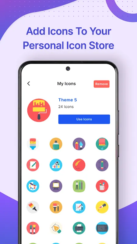
Suddenly my phone breathed. Where generic blues once formed a corporate mosaic, my grandmother's watercolor painting became my messages portal. My favorite coffee shop's logo replaced the sterile maps pin. Even my banking app - that anxiety-inducing dollar sign - now displayed a photo of my childhood piggy bank. The technical magic behind this visual alchemy fascinated me: **the app creates custom web clips** that bypass Apple's walled garden, essentially tricking iOS into displaying your creations as legitimate applications. Yet this wizardry came with frustrating limitations - each new icon required manually deleting the original from my home screen, a tedious dance of drag-and-delete that felt like technological penance for daring to personalize.
Emotionally, the changes created ripples I never anticipated. Opening my finance app no longer triggered instant dread when greeted by my chubby ceramic pig rather than clinical currency symbols. My productivity soared when my to-do list appeared as a vibrant post-it replica instead of a sterile checklist. Yet the illusion shattered whenever I searched via Spotlight - there in the results list sat the original corporate icons like uninvited ghosts at my personalization party. The **cognitive dissonance** created actual physical tension in my shoulders - joy when navigating my home screen, frustration when interacting with iOS's underlying architecture.
Creating custom icons became my nightly therapy. I'd sip cabernet while transforming apps into visual diary entries - my hiking app featuring Summit the golden retriever who joined every trail adventure, my camera roll represented by my first childhood Polaroid. The editor's masking tools proved astonishingly precise, allowing me to cut around complex shapes with surgical accuracy. But the app's Achilles heel emerged when sharing creations - exporting custom icons required navigating a labyrinthine sequence of menus that felt intentionally obtuse. I cursed aloud when trying to send my masterpiece weather icon to my sister, nearly giving up before discovering the hidden "share" button buried beneath three submenus.
Two weeks post-transformation, my phone feels less like a tool and more like an extension of consciousness. The tactile pleasure of tapping my custom book icon (a worn leather cover photo) before reading rivals turning physical pages. Yet the **battery drain** became impossible to ignore - my formerly all-day device now gasping for power by 3 PM, sacrificed at the altar of aesthetics. This constant negotiation between beauty and functionality mirrors life itself - we constantly balance what sparks joy against what sustains function. My phone now reflects not corporate design philosophy, but my messy, beautiful, power-hungry human experience - flaws and triumphs displayed in a grid that finally feels like home.
Keywords:Icon Changer And Icon Editor,news,iOS customization,personal branding,app limitations


